U-NEXT
U-NEXT
U-NEXT
Reasonably adding feature for sports category on cross-deviced video and streaming service
Reasonably adding feature for sports category on cross-deviced video and streaming service
Reasonably adding feature for sports category on cross-deviced video and streaming service
Responsibility
Interaction Design, Wireframing, Prototyping, Usability Testing, Visual Design
Responsibility
Interaction Design, Wireframing, Prototyping, Usability Testing, Visual Design
Responsibility
Interaction Design, Wireframing, Prototyping, Usability Testing, Visual Design
Created With
Figma, Google Jamboard, Google Spreadsheet, JIRA, Confluence
Created With
Figma, Google Jamboard, Google Spreadsheet, JIRA, Confluence
Created With
Figma, Google Jamboard, Google Spreadsheet, JIRA, Confluence
Overview
U-NEXT is an entertainment platform based in Japan that boasts the highest level of recognition as a video and live streaming service, alongside Netflix and Prime Video (Amazon) for almost a decade.
Source: Annual SVOD market report in 2023 by GEM Standard
Starting in the autumn of 2022, U-NEXT expanded its content offerings by introducing sports channels, specifically SPOTV from South Korea. Since when our service has focused on movies, dramas, and anime, this addition marked the incorporation of a new axis centered around sports.
In response to this expansion, tailoring UI and generating necessary visuals for sports genre and content was required. And the key focus is on achieving a significant impact with minimal resources on the existing service.
Challenges
We focus heavily on marketing to stay competitive. However, due to a specialist shortage dedicated to development and design, there are several challenges including:
Lack of resources for developers and marketing designers despite strict deadlines for scheduled marketing campaigns
An enormous amount of thumbnails is required to cover almost all matches broadcast on SPOTV.
To the difference of theory on SPOTV and U-NEXT, using totally the same thumbnails may cause friction in experience.
Workflow
As I worked on this project with two perspectives of UI and Experience Design and Thumbnail Design, I'll explain these in divided section as follows.
Workflow
As I worked on this project with two perspectives of UI and Experience Design and Thumbnail Design, I'll explain these in divided section as follows.
Workflow
As I worked on this project with two perspectives of UI and Experience Design and Thumbnail Design, I'll explain these in divided section as follows.
- UI and Experience Design
"Small things create big changes"
The sports content delivered by SPOTV includes multiple genres such as the following:
Baseball - MLB
Soccer
Basketball
Futsal
Hockey
Ice Hockey
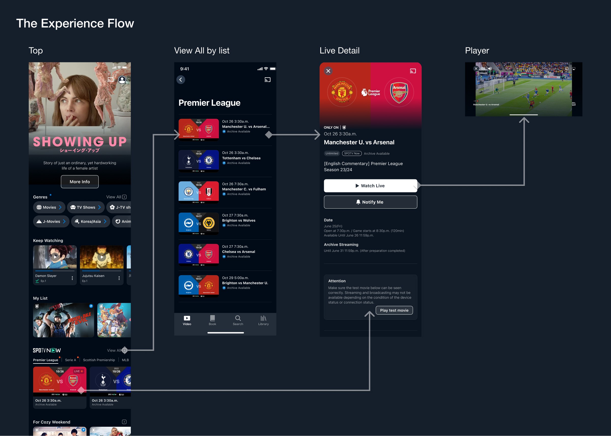
Brief storyboard
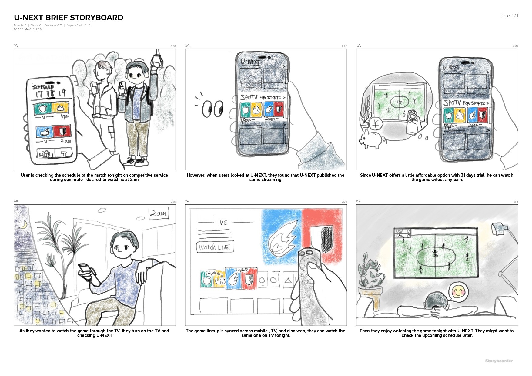
▲ Brief storyboard of U-NEXT (for newcomers or revisitors - the majority of users are repeating unsubscribe and resubscribe)
The key takeaway of this storyboard was that we have multiple genres not only soccer but also baseball, basketball and hockey. We had to consider either brief search feature or filtering feature to make this story real.
Besides that, since SPOTV is part of our service, we wanted to emphasize it while users explore our app.
Choice and arrange existing components
To streamline the workload, We took the content block with tab UI that was originally used for genre filtering in e-books for SPOTV's genre filtering. As search by genre is already there on the book domain which already exists, we could reuse it to place without creating any new page.
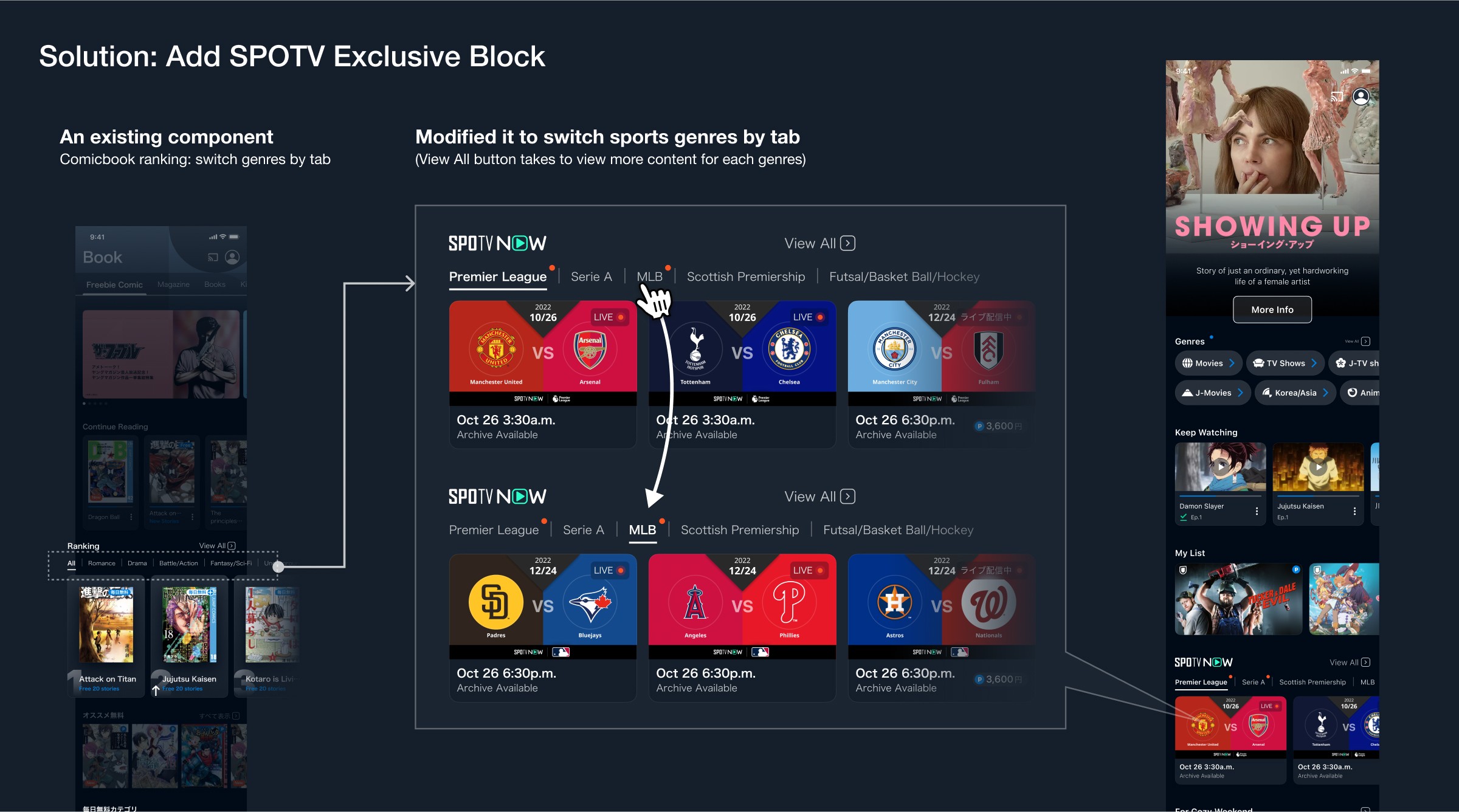
This made it possible to take users to the player without any big changes in the existing experience flow. After "View All by List" screen doesn't have any changes in the UI.
- UI and Experience Design
"Small things create big changes"
The sports content delivered by SPOTV includes multiple genres such as the following:
Baseball - MLB
Soccer
Basketball
Futsal
Hockey
Ice Hockey
Brief storyboard
▲ Brief storyboard of U-NEXT (for newcomers or revisitors - the majority of users are repeating unsubscribe and resubscribe)
The key takeaway of this storyboard was that we have multiple genres not only soccer but also baseball, basketball and hockey. We had to consider either brief search feature or filtering feature to make this story real.
Besides that, since SPOTV is part of our service, we wanted to emphasize it while users explore our app.
Choice and arrange existing components
To streamline the workload, We took the content block with tab UI that was originally used for genre filtering in e-books for SPOTV's genre filtering. As search by genre is already there on the book domain which already exists, we could reuse it to place without creating any new page.
This made it possible to take users to the player without any big changes in the existing experience flow. After "View All by List" screen doesn't have any changes in the UI.
- Thumbnail Design
Use Auto-generated images to reduce resource costs
Although thumbnail creation is the responsibility of the Communication Design department, relying on them for thumbnail creation was not ideal due to the lack of resources.
I took the lead together with the Product Owner, and we planned to create a system for "Automatically Generated Thumbnail" to deal with the circumstances.
How it works
The specific workflow involved:
Connecting to the company's database and the API shared with SPOTV.
Integrating that information with the design of the website.
Capturing the screen to generate thumbnails.
Executing this process as long as there is data available.
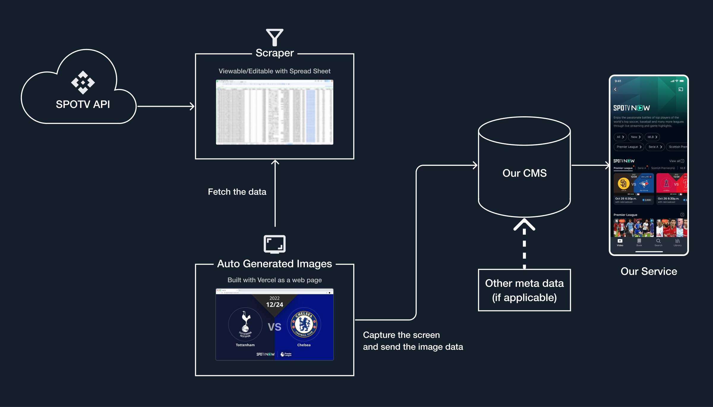
▲ How the system works (Overview)
The entire workload started from design, then passed to the web development team, and lastly to the backend scraping team to capture and upload this automatically into our CMS to publish.
Ideation
The first ideation with five types of thumbnails was made within less than 2 weeks. However, as the system had some constraints, I modified the original one to make it possible to generate through the system.
Since the thumbnails on SPOTV already exist, firstly I copied the idea to inherit their theory to introduce SPOTV properly. However, since there were gaps in theory between SPOTV and U-NEXT, I modified it by researching match game thumbnails for soccer, baseball, and ice hockey in particular on the internet.
- Thumbnail Design
Use Auto-generated images to reduce resource costs
Although thumbnail creation is the responsibility of the Communication Design department, relying on them for thumbnail creation was not ideal due to the lack of resources.
I took the lead together with the Product Owner, and we planned to create a system for "Automatically Generated Thumbnail" to deal with the circumstances.
How it works
The specific workflow involved:
Connecting to the company's database and the API shared with SPOTV.
Integrating that information with the design of the website.
Capturing the screen to generate thumbnails.
Executing this process as long as there is data available.
▲ How the system works (Overview)
The entire workload started from design, then passed to the web development team, and lastly to the backend scraping team to capture and upload this automatically into our CMS to publish.
Ideation
The first ideation with five types of thumbnails was made within less than 2 weeks. However, as the system had some constraints, I modified the original one to make it possible to generate through the system.
Since the thumbnails on SPOTV already exist, firstly I copied the idea to inherit their theory to introduce SPOTV properly. However, since there were gaps in theory between SPOTV and U-NEXT, I modified it by researching match game thumbnails for soccer, baseball, and ice hockey in particular on the internet.
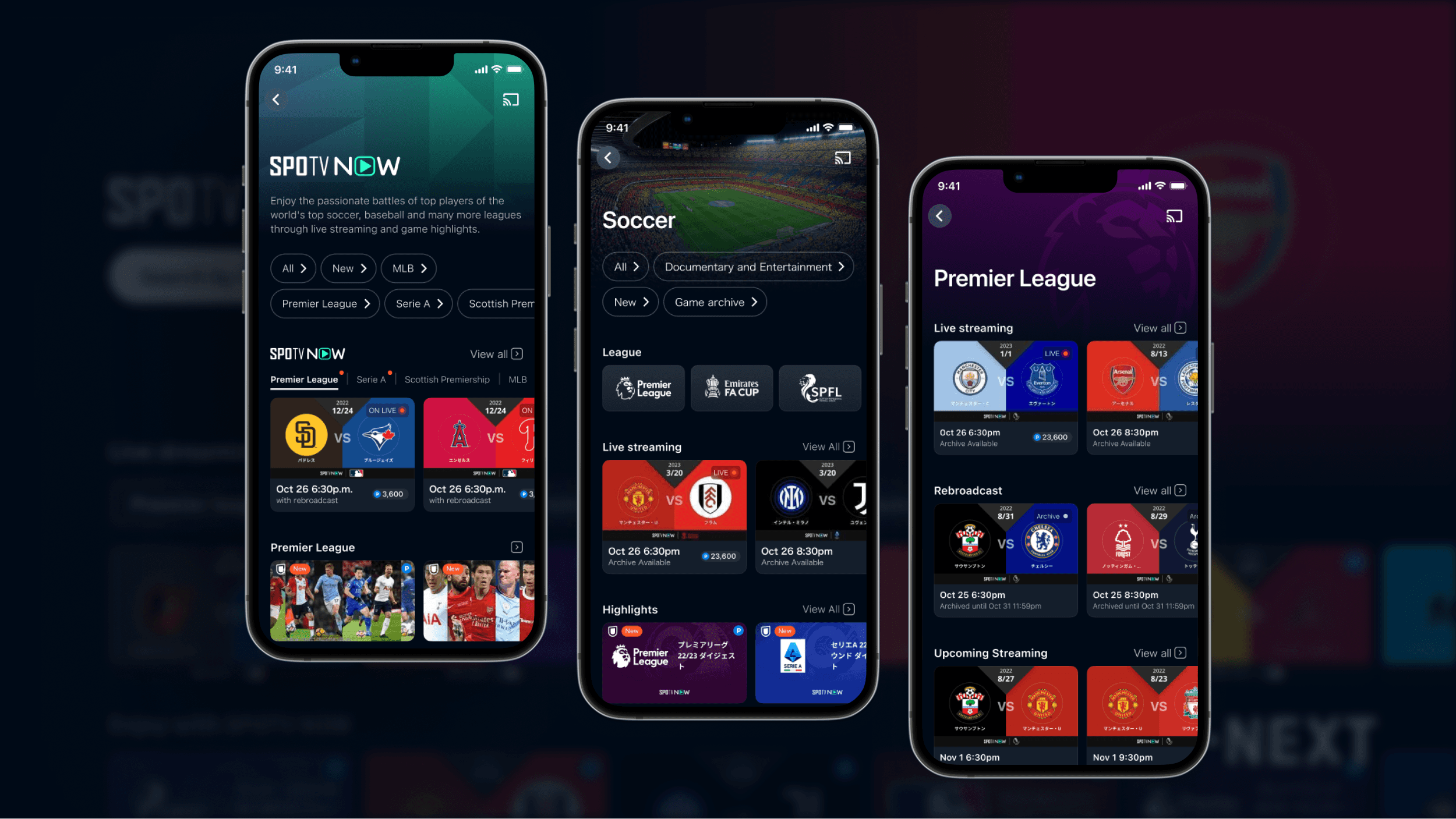
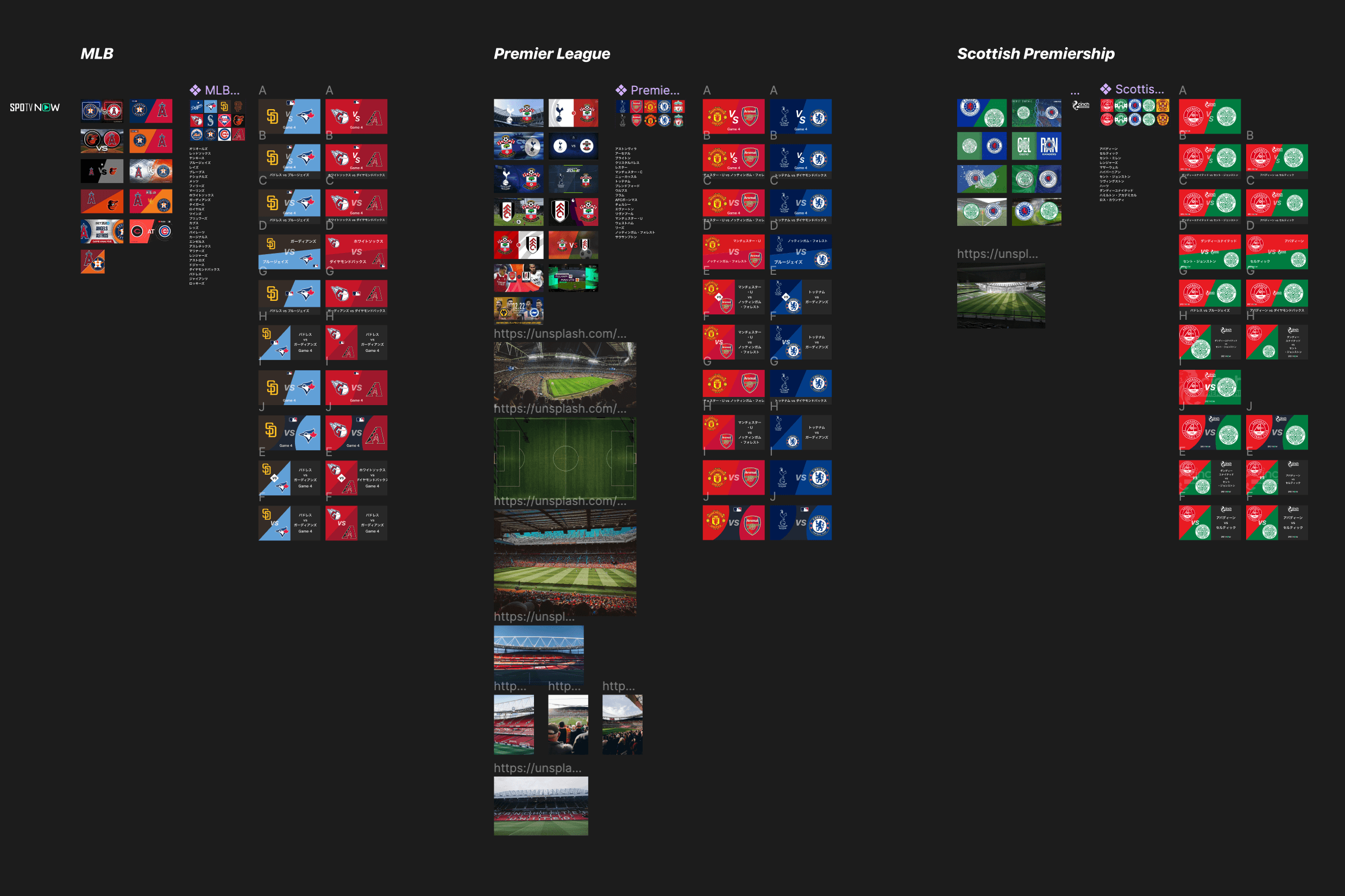
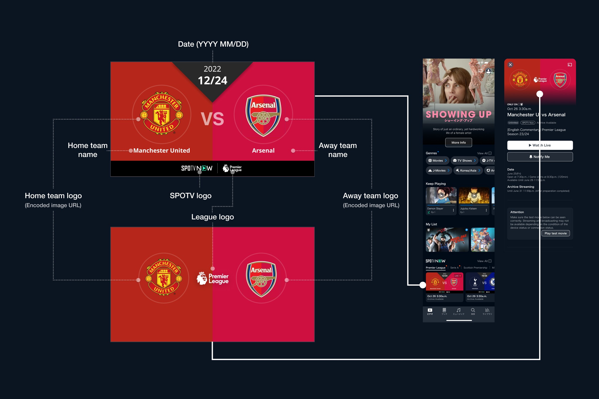
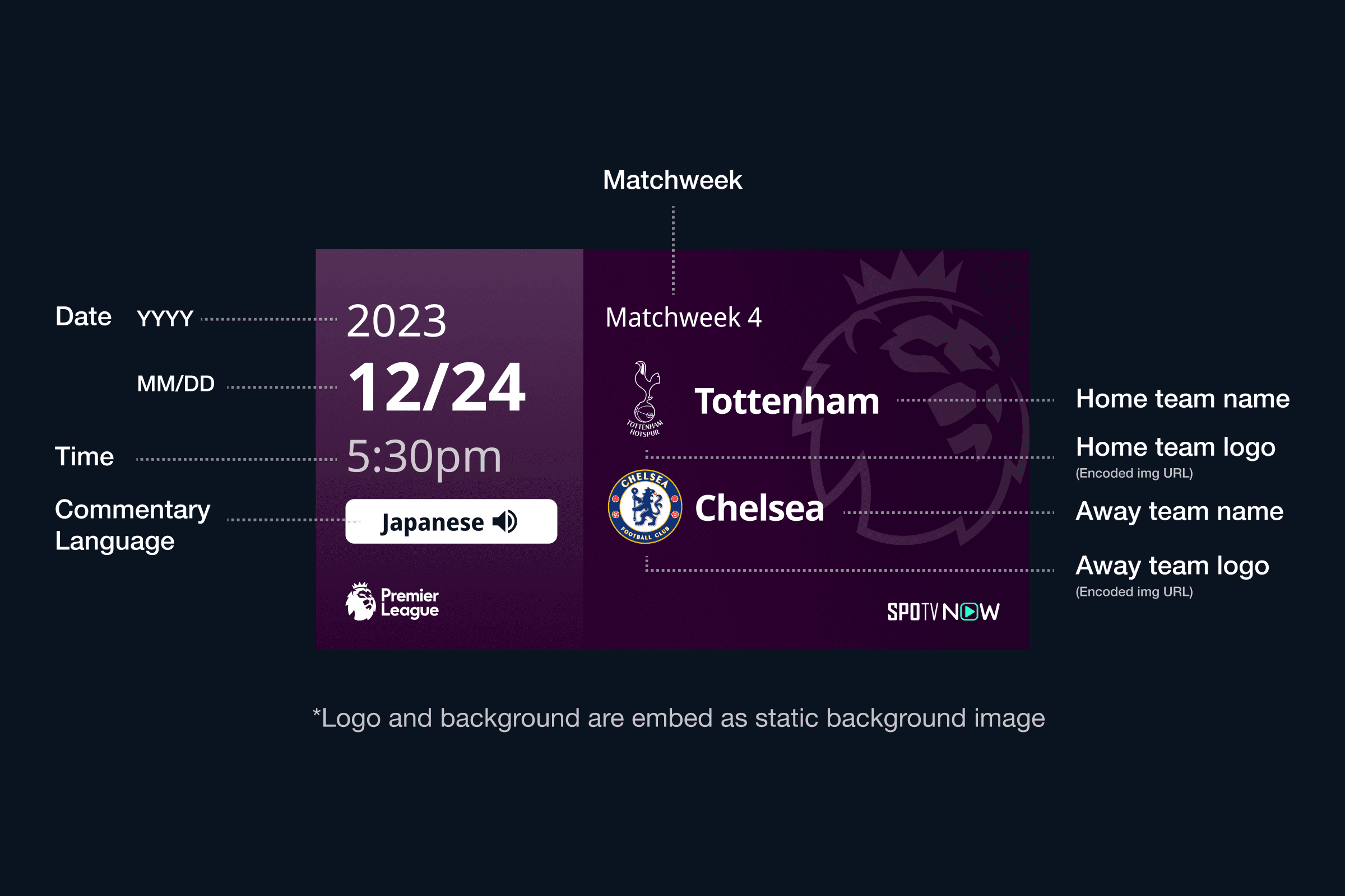
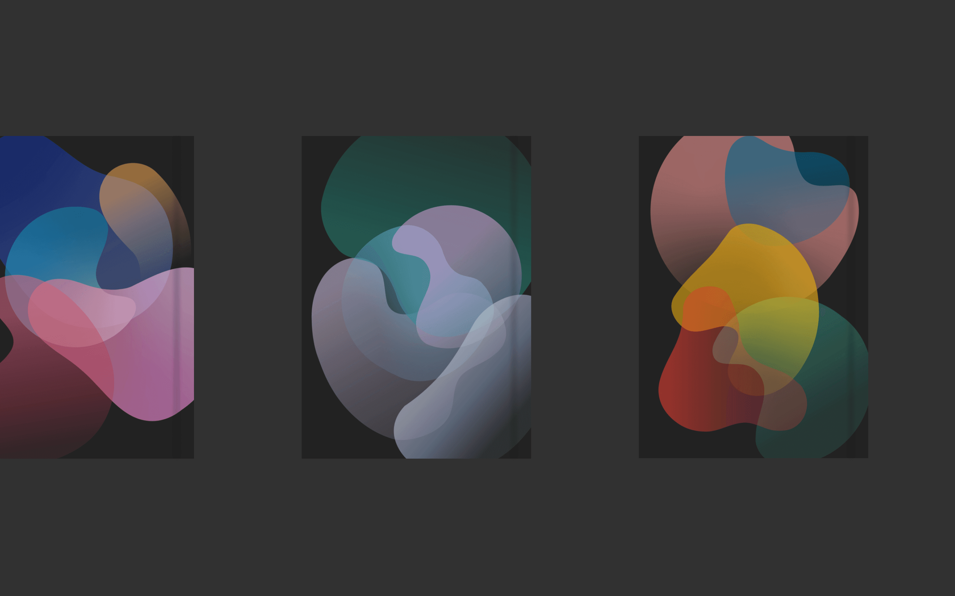
Output Version 1
Since the thumbnail size would be quite small due to the device size, I tried explaining each team by color and logos rather than characters. Since all the necessary meta is at the bottom or side of each thumbnail, added only essential information such as date, team, league logo and SPOTV logo.
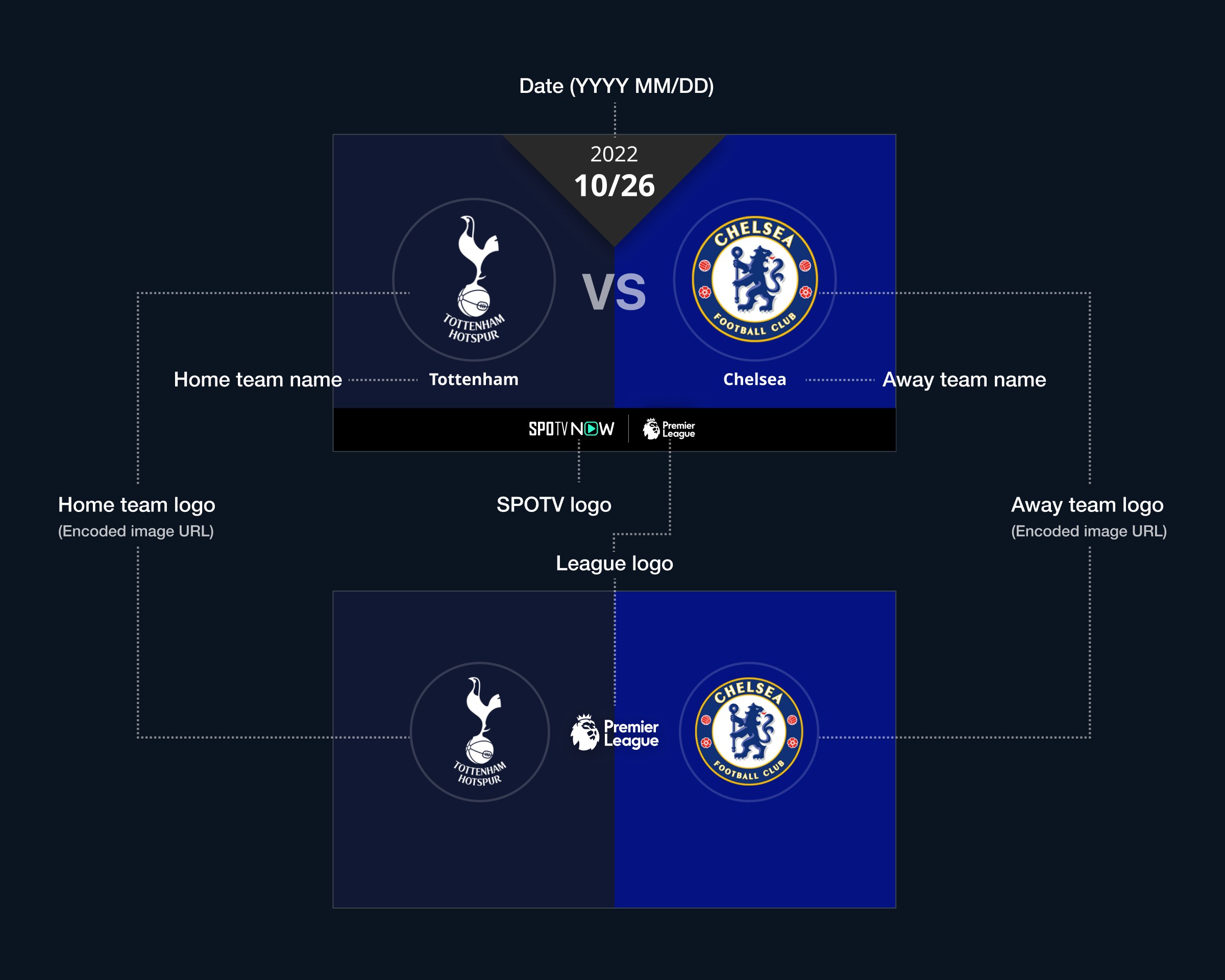
Those two images above is used in all the available devices for thumbnail and detail screen.
Output Version 1
Since the thumbnail size would be quite small due to the device size, I tried explaining each team by color and logos rather than characters. Since all the necessary meta is at the bottom or side of each thumbnail, added only essential information such as date, team, league logo and SPOTV logo.
Those two images above is used in all the available devices for thumbnail and detail screen.
Key Considerations in Production
Delivering High-Quality Outputs as Quickly as Possible
The following are what I considered while designing:
Start by creating simple designs that can be easily modified to make it agile.
Consider development-friendly design to the integration of web development quicker.
To address these, I tried a component-based approach resembling a scaled-down version of the design system on Figma so that I could introduce different patterns that have consistency.
Handling Edge Cases
As text and logos flow automatically from the API, uncontrollable strings and exceptional logo images may have been exist. To address this, we investigated possible cases and adopted the following methods:
Match the logo color to the background color when the background is white to prevent the text from disappearing.
Concatenate excessively long strings.
Design layouts to accommodate all text neatly, except in extreme and exceptional cases.
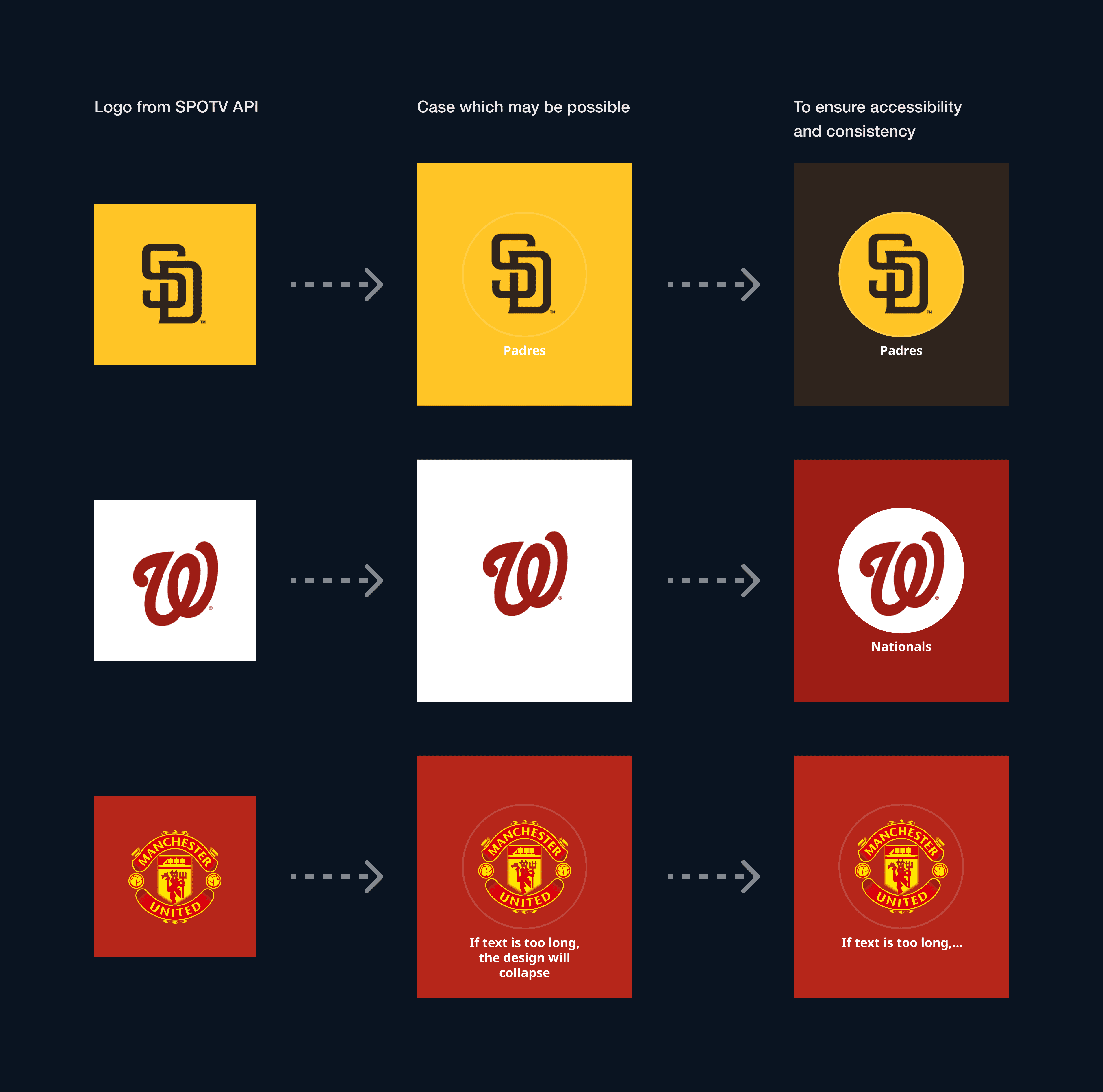
▲ To prevent disappearing team names when white or bright-colored background is shown, I defined condition that secondary color on the logo will be used if the background color's lightness in HSL is greater than 55.
Key Considerations in Production
Delivering High-Quality Outputs as Quickly as Possible
The following are what I considered while designing:
Start by creating simple designs that can be easily modified to make it agile.
Consider development-friendly design to the integration of web development quicker.
To address these, I tried a component-based approach resembling a scaled-down version of the design system on Figma so that I could introduce different patterns that have consistency.
Handling Edge Cases
As text and logos flow automatically from the API, uncontrollable strings and exceptional logo images may have been exist. To address this, we investigated possible cases and adopted the following methods:
Match the logo color to the background color when the background is white to prevent the text from disappearing.
Concatenate excessively long strings.
Design layouts to accommodate all text neatly, except in extreme and exceptional cases.
▲ To prevent disappearing team names when white or bright-colored background is shown, I defined condition that secondary color on the logo will be used if the background color's lightness in HSL is greater than 55.
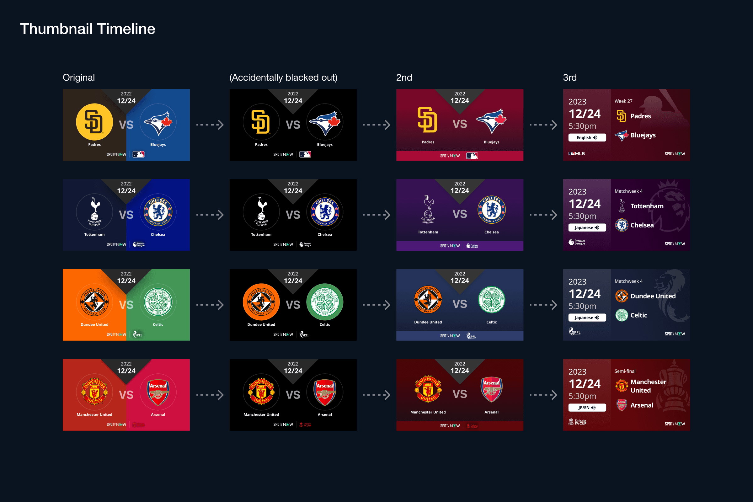
Outcomes Version 2 and 3
The UI was successfully released, but there were instances where improvements were needed for thumbnails post-release, leading to several revisions.
Improvement Due to Issues - Ver2
One day, unexpected changes in the content of the external API resulted in the removal, and all thumbnail's backgrounds went blackened. As a solution, I redesigned the thumbnail with the removal of the automated background.
However, only removing the background made it difficult to distinguish between games and leagues. To resolve this, the approach of "extracting a single color from the league logo and using it as the background color" previously employed in other thumbnails(i.e. thumbnails for sports video content, not live streaming) was adopted for match thumbnails as well.
Applying the same hue as the league logo color on the background on the thumbnail made it easier to identify which games are for which leagues.
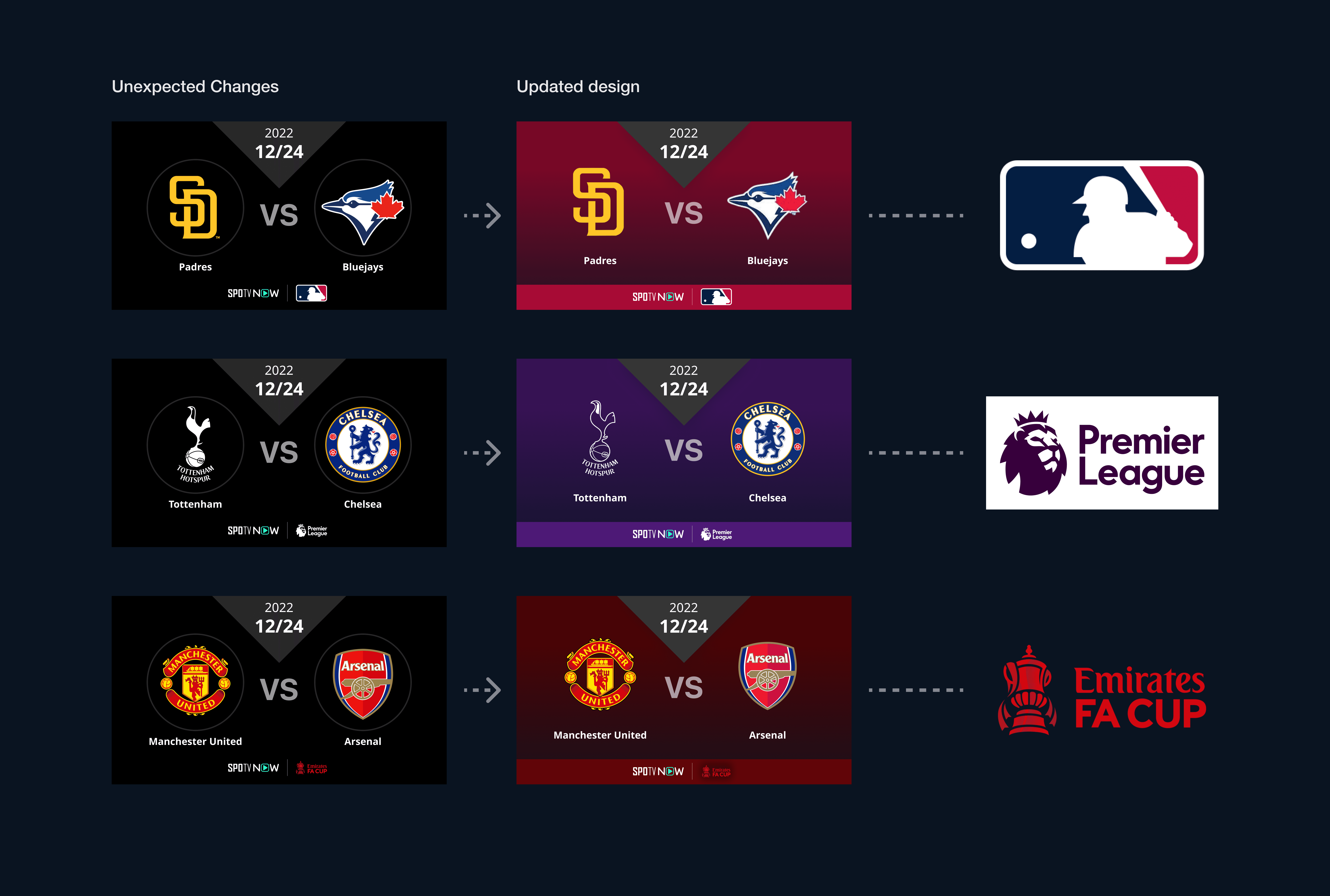
▲ Picked one color from league logo and adjusted them to ensure contrast
Improvement Based on User Feedback - Ver3
When LALIGA was newly added to our league lineup as exclusive licensed content, user interviews were conducted to gather feedback. Necessary information was added and refined based on the received feedback.
Soccer emerged as the most-watched genre, with diverse users ranging from passionate fans of specific teams and leagues to those who watch various soccer matches from the World Cup.
Consequently, the design prioritized information crucial to soccer, and the insights gained from this were applied to other genres.
Reordered information by priority by referencing thumbnails from platforms like YouTube for LALIGA and Premier League. This involved organizing the font size and color
Considered not only on the web and mobile but also on TV which has very limited spaces with strict constraints to adding information
Ensured all essential information should be visible
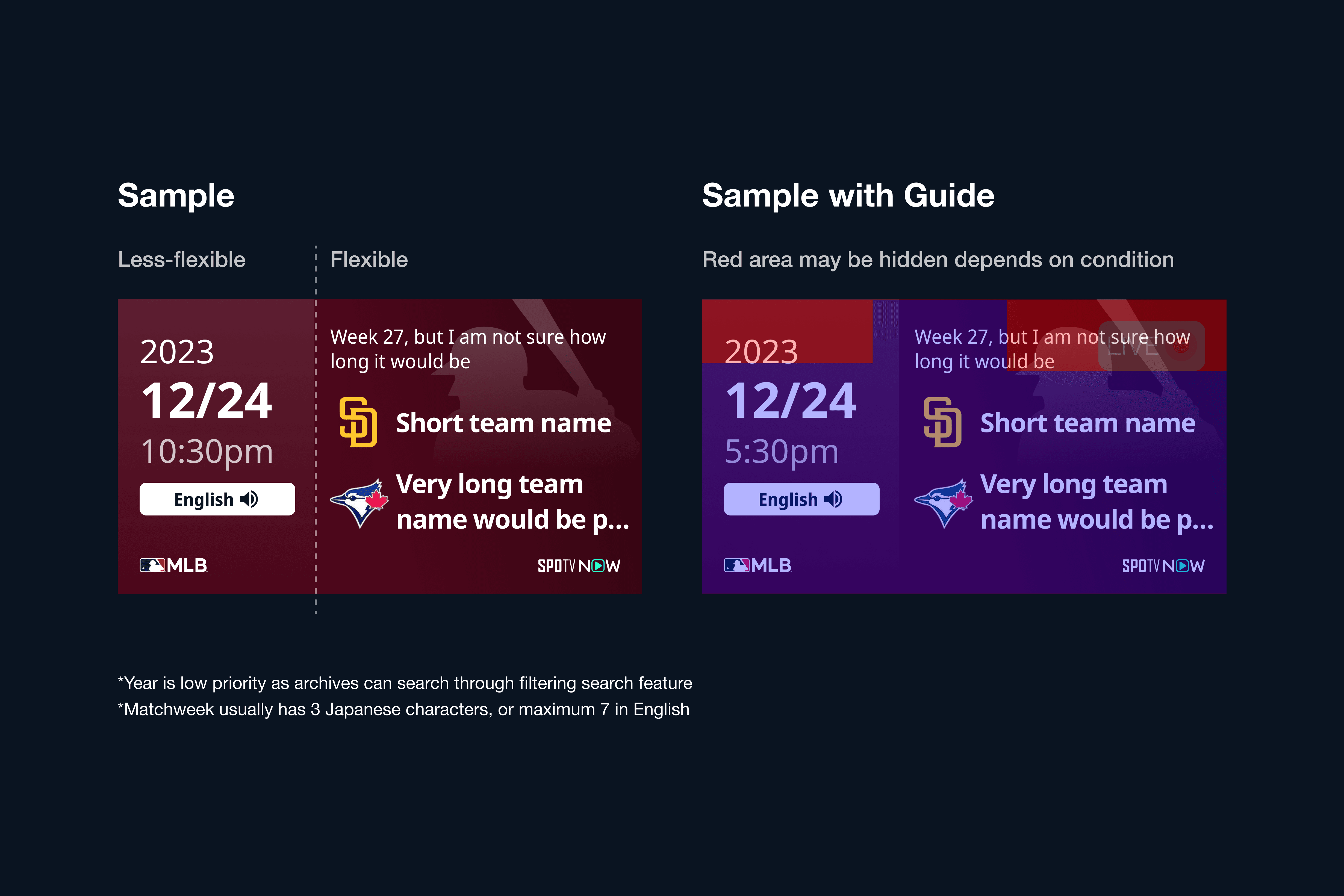
The following included (order by prioritization):Start date and time of the broadcast
League
Team
Round
Commentary Language
SPOTV's logo, if provided
By the priority of date and time, Divided sections into less flexible ones and flexible ones. Since the name could be 20+ characters long depending on the team, I placed team name and match name in the flexible section, and the date, time and language were placed in the less flexible section.
Considered Durability of Accuracy on TV and mobile
Since TV is an important device to watch sports, considering accuracy on both TV and mobile is key. Since both thumbnails could look very tiny by the assumption of TV which could be watched from 3 meters away in the living room, I made font size bigger as much as possible while keeping the dynamics of weights.
Lastly, here is the timeline of how the thumbnail changed. This is how I handled the prioritization of accessible thumbnails across different types of devices.
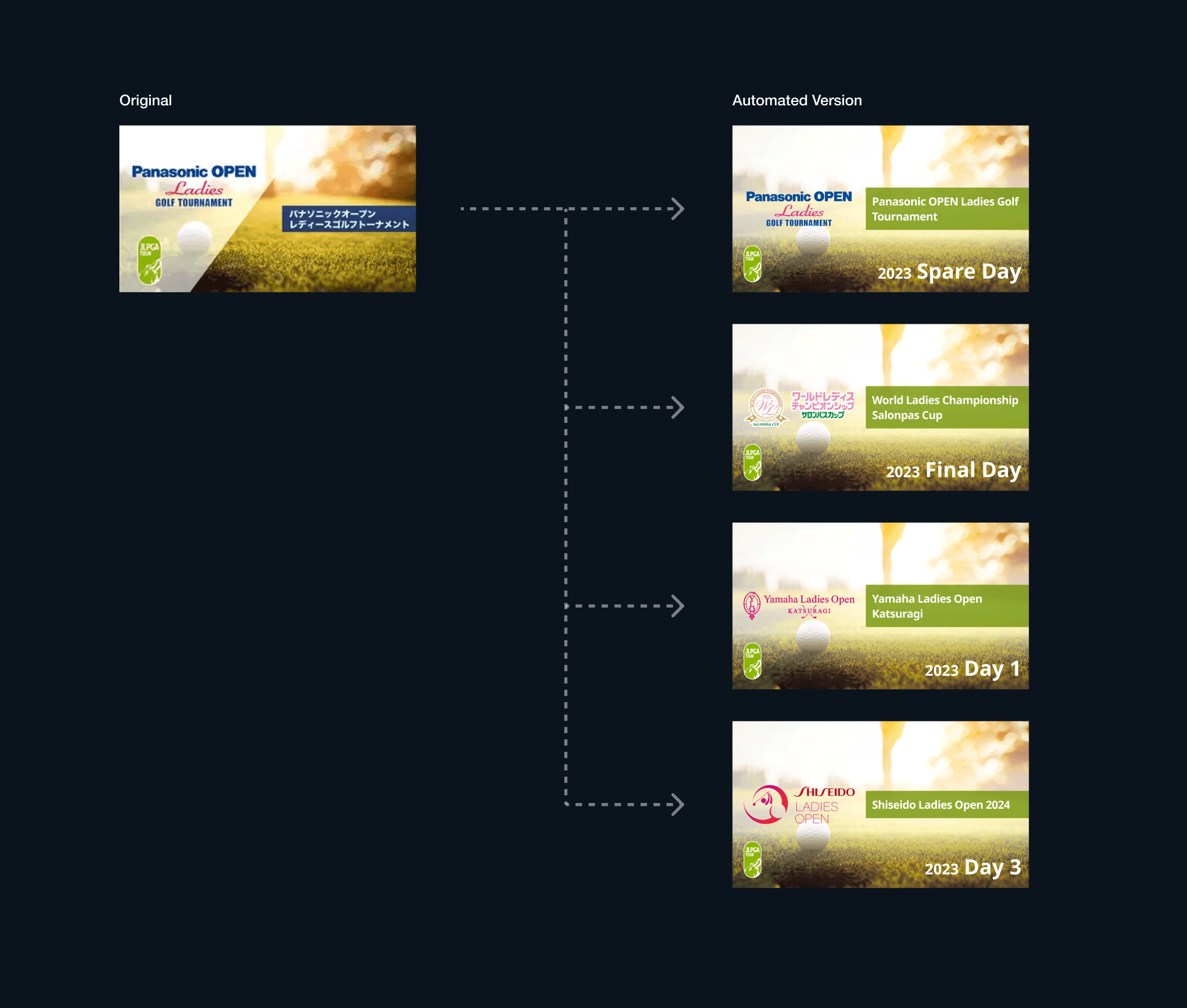
Expansion for other categories
The solution above was made only for the matches. However, we still had a pain in quick delivery for thumbnails in golf tour live streamings and videos. We also replaced the golf tour one with auto-generated images. It has been quickly made within two weeks from the kickstart to the final development.
Outcomes Version 2 and 3
The UI was successfully released, but there were instances where improvements were needed for thumbnails post-release, leading to several revisions.
Improvement Due to Issues - Ver2
One day, unexpected changes in the content of the external API resulted in the removal, and all thumbnail's backgrounds went blackened. As a solution, I redesigned the thumbnail with the removal of the automated background.
However, only removing the background made it difficult to distinguish between games and leagues. To resolve this, the approach of "extracting a single color from the league logo and using it as the background color" previously employed in other thumbnails(i.e. thumbnails for sports video content, not live streaming) was adopted for match thumbnails as well.
Applying the same hue as the league logo color on the background on the thumbnail made it easier to identify which games are for which leagues.
▲ Picked one color from league logo and adjusted them to ensure contrast
Improvement Based on User Feedback - Ver3
When LALIGA was newly added to our league lineup as exclusive licensed content, user interviews were conducted to gather feedback. Necessary information was added and refined based on the received feedback.
Soccer emerged as the most-watched genre, with diverse users ranging from passionate fans of specific teams and leagues to those who watch various soccer matches from the World Cup.
Consequently, the design prioritized information crucial to soccer, and the insights gained from this were applied to other genres.
Reordered information by priority by referencing thumbnails from platforms like YouTube for LALIGA and Premier League. This involved organizing the font size and color
Considered not only on the web and mobile but also on TV which has very limited spaces with strict constraints to adding information
Ensured all essential information should be visible
The following included (order by prioritization):Start date and time of the broadcast
League
Team
Round
Commentary Language
SPOTV's logo, if provided
By the priority of date and time, Divided sections into less flexible ones and flexible ones. Since the name could be 20+ characters long depending on the team, I placed team name and match name in the flexible section, and the date, time and language were placed in the less flexible section.
Considered Durability of Accuracy on TV and mobile
Since TV is an important device to watch sports, considering accuracy on both TV and mobile is key. Since both thumbnails could look very tiny by the assumption of TV which could be watched from 3 meters away in the living room, I made font size bigger as much as possible while keeping the dynamics of weights.
Lastly, here is the timeline of how the thumbnail changed. This is how I handled the prioritization of accessible thumbnails across different types of devices.
Expansion for other categories
The solution above was made only for the matches. However, we still had a pain in quick delivery for thumbnails in golf tour live streamings and videos. We also replaced the golf tour one with auto-generated images. It has been quickly made within two weeks from the kickstart to the final development.
Result
✅ Cut-off costs of 1-2 graphic designer and 3-4 developer resources
Since the lack of resources for graphic designers and developers was a significant issue in streaming live shows in time, cutting off the costs of resources was necessary. If all the thumbnails were manually made only for the sports genre, it would take at least 48+ hours for each category with 2 or more designers, however, this made us make thumbnails just in seconds with consistency.
✅ Built flexible, expandable architecture
This is now reusable for any repeatable sports games/matches by adjusting base architecture even if any other category comes up such as horse racing, tennis, or even K-1 and wrestling.
Other Project
I worked on some other projects voluntarily such as the improvement of help center page, creating a media website from scratch to strengthen our service's SEO score, component library improvement, and so on. Within all the projects, I am always considering DesignOps to make maintaining and updating products easy for everyone.
See Also:
See Also:
See Also:
Takenaka
Strengthen brand presence with experience design for Japanese Food Truck
Branding, UI/UX, Frontend Development
Liber
Building community for liberal arts through the media website
UI/UX design, Front-end development
SavvyDine
Designing Points of Sales system app for restaurant servers and customers
UI/UX Design, Mobile app design

roomvu
Design System development for Real Estate Marketing SaaS
Frontend Development, Design System Development
Takenaka
Strengthen brand presence with experience design for Japanese Food Truck
Branding, UI/UX, Frontend Development
Liber
Building community for liberal arts through the media website
UI/UX design, Front-end development
SavvyDine
Designing Points of Sales system app for restaurant servers and customers
UI/UX Design, Mobile app design
roomvu
Design System development for Real Estate Marketing SaaS
Frontend Development, Design System Development