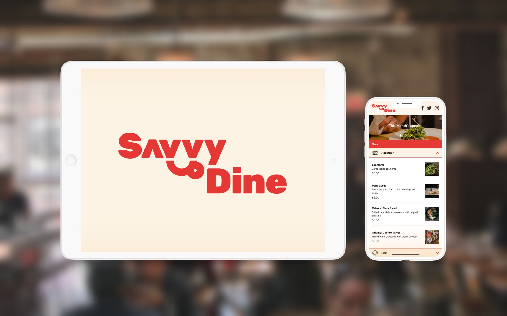
SavvyDine
SavvyDine
SavvyDine
Designing Points of Sales system app for restaurant servers and customers
Designing Points of Sales system app for restaurant servers and customers
Designing Points of Sales system app for restaurant servers and customers
Responsibility
UI/UX Design, Mobile app design
Responsibility
UI/UX Design, Mobile app design
Responsibility
UI/UX Design, Mobile app design
Created With
Figma
Created With
Figma
Created With
Figma
Project Background
I conducted UI and UX design for software for restaurant and their customer, which is offered by my friend's newly established company to expand his business opportunity. We built a Point of Sales app for iPad and their dashboard.
👀 What is Point of Sales?
The point-of-sales system offers the restaurant server to manage orders and sales. Traditional products are sold as huge machines.
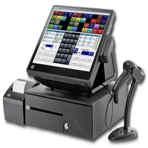
However, this one usually has these issues.
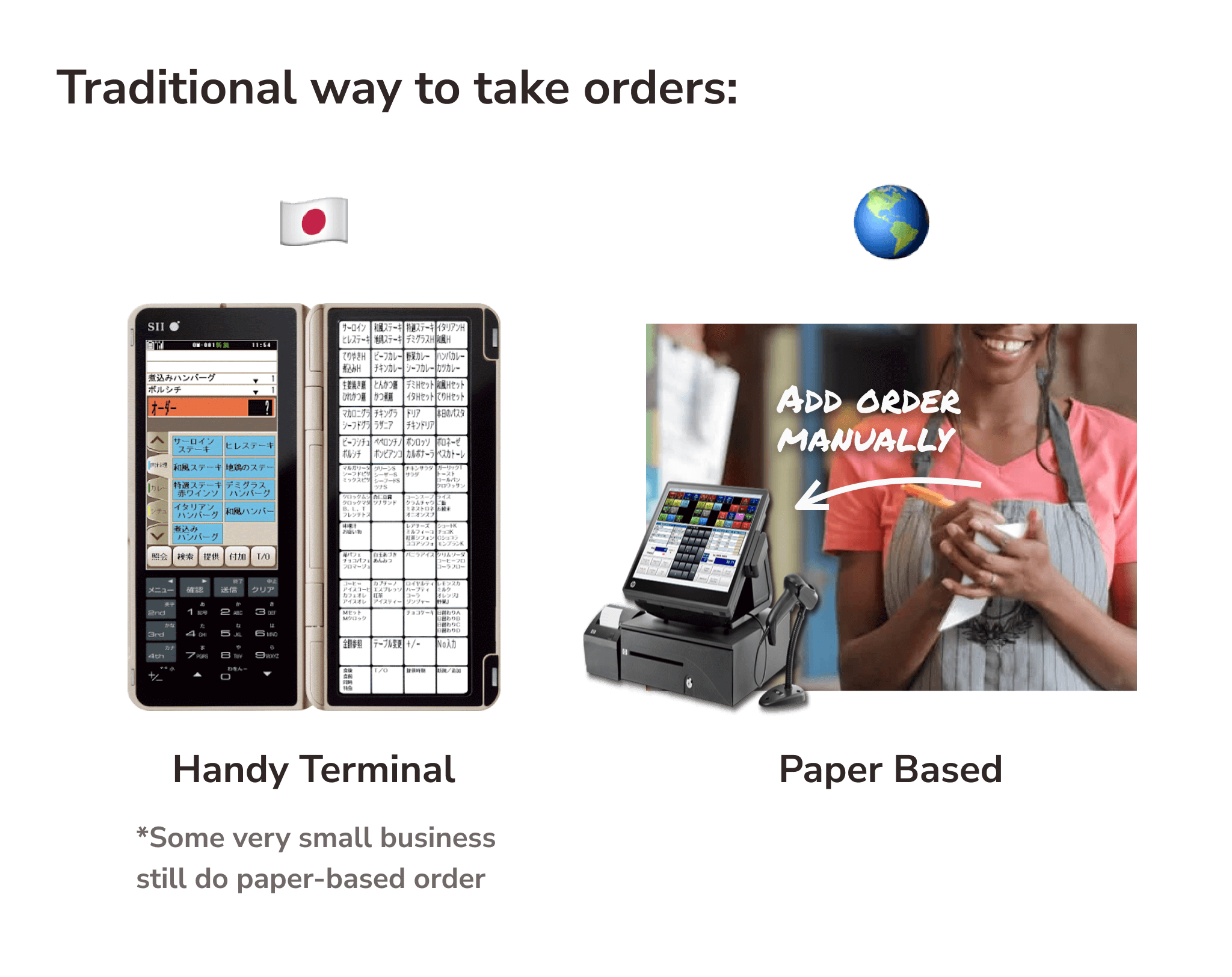
NOT portable
Every time, servers have to jot down orders and add them manually
NOT cheap
Businesses may need to pay $$$$$ as an initial cost
NOT easy to use
Complicated interface, huge learning cost
Cannot manage serving, takeout, and delivery altogether
Goal: Resolve 3 NOTs
Then, we thought we can solve these 3 NOTs by offering our system
Portable
Servers can add orders directly in the iPad app
Cheap
iPad can be much cheaper than the traditional system
Easy to use
The user-friendly interface even for the trainee
Can manage serving, takeout, or delivery all in one app
💡Tip: Although some portable POS systems (called "Handy Terminal" or "Handy") are available in some restaurant chains in Japan, There are still a lot of businesses that manage orders by writing on paper - especially outside Japan.
UI Goals
Since all the restaurant requires to deliver as quickly as possible, there were the following requirements:
Keyword: Speed Is the King
Minimize the number of tap and screen transition
Has accuracy in the flow and actual UI when the staff sends orders.
Staff can identify whether the seats are available, in use, or ready for the next order promptly
Staff can check and switch to other orders as quickly as possible(if dine-in)
I aimed to design clean, friendly but reasonable Interface and Experience for restaurant servers (B2B) on the iPad app.
Project Background
I conducted UI and UX design for software for restaurant and their customer, which is offered by my friend's newly established company to expand his business opportunity. We built a Point of Sales app for iPad and their dashboard.
👀 What is Point of Sales?
The point-of-sales system offers the restaurant server to manage orders and sales. Traditional products are sold as huge machines.
However, this one usually has these issues.
NOT portable
Every time, servers have to jot down orders and add them manually
NOT cheap
Businesses may need to pay $$$$$ as an initial cost
NOT easy to use
Complicated interface, huge learning cost
Cannot manage serving, takeout, and delivery altogether
Goal: Resolve 3 NOTs
Then, we thought we can solve these 3 NOTs by offering our system
Portable
Servers can add orders directly in the iPad app
Cheap
iPad can be much cheaper than the traditional system
Easy to use
The user-friendly interface even for the trainee
Can manage serving, takeout, or delivery all in one app
💡Tip: Although some portable POS systems (called "Handy Terminal" or "Handy") are available in some restaurant chains in Japan, There are still a lot of businesses that manage orders by writing on paper - especially outside Japan.
UI Goals
Since all the restaurant requires to deliver as quickly as possible, there were the following requirements:
Keyword: Speed Is the King
Minimize the number of tap and screen transition
Has accuracy in the flow and actual UI when the staff sends orders.
Staff can identify whether the seats are available, in use, or ready for the next order promptly
Staff can check and switch to other orders as quickly as possible(if dine-in)
I aimed to design clean, friendly but reasonable Interface and Experience for restaurant servers (B2B) on the iPad app.
Workflow
1. Define Specifications, Create Rough Drafts
The outline of the flow was provided by the client because they want to launch the service as soon as possible.
I put them into actual UI by creating high-fidelity mockups to correspond to specifications.
Check and refine specifications with Store Owners
I checked requirements not just within the team but the actual restaurant as a potential user to get to know how to use or if there are any blockers on current POS systems, together with drawing screen transition diagrams and wireframes.
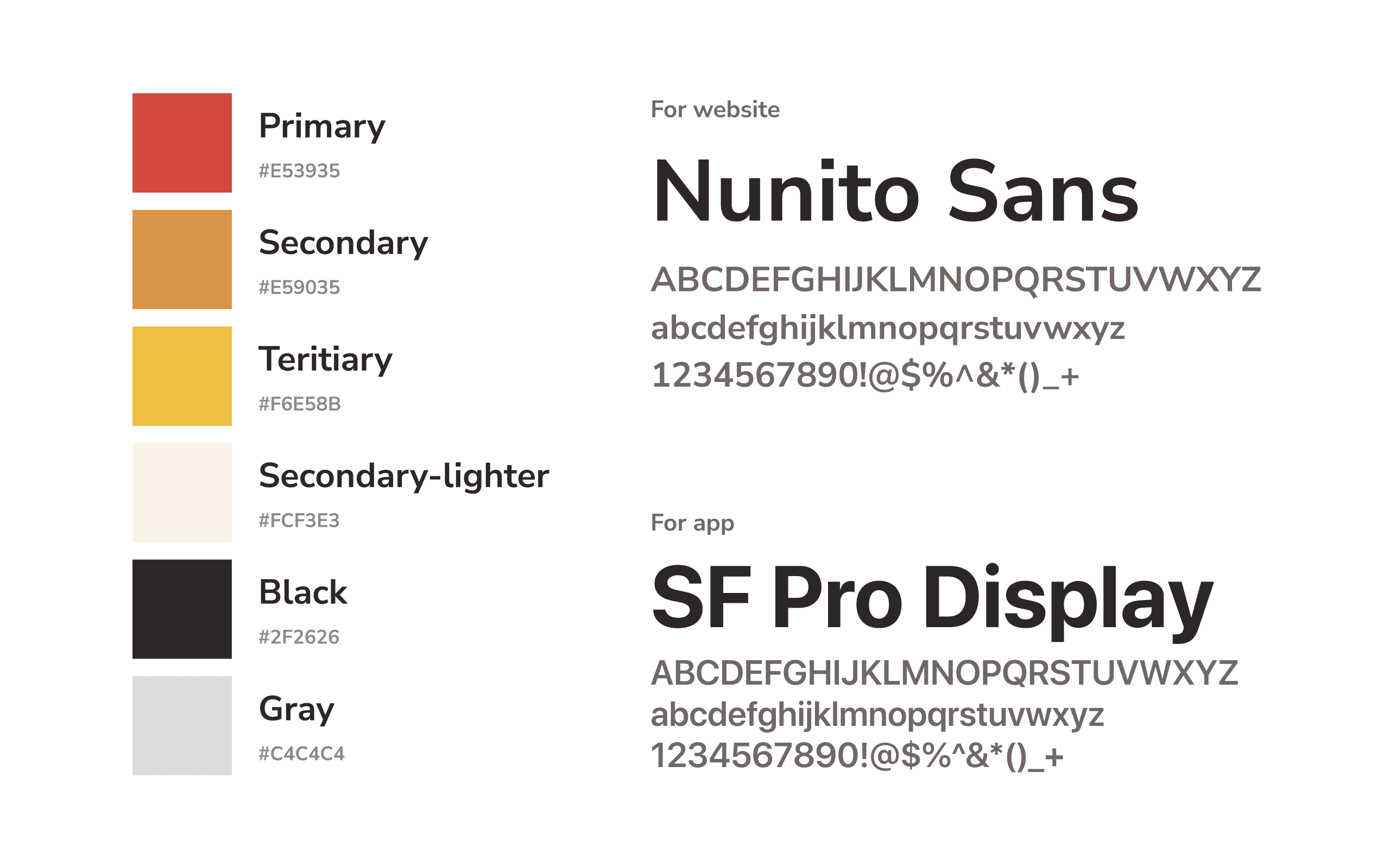
2. Define Key Colour and Typography
Based on the red colour which illustrates energy and enjoyment at the dining experience, I also used orange and yellow as analogical colours. For the typography, Nunito Sans is mainly used for Web app, however, I determined to use a standard font for each OS, to consider stable readability and development cost.
3. Create Design Guidelines
I made design guidelines by making key elements as components to minify design costs for creation and modification. It also made me possible to provide semantic design with accuracy in the structure of Figma file thanks to Variants, Auto Layout, and some other features.

Header and Nav Components
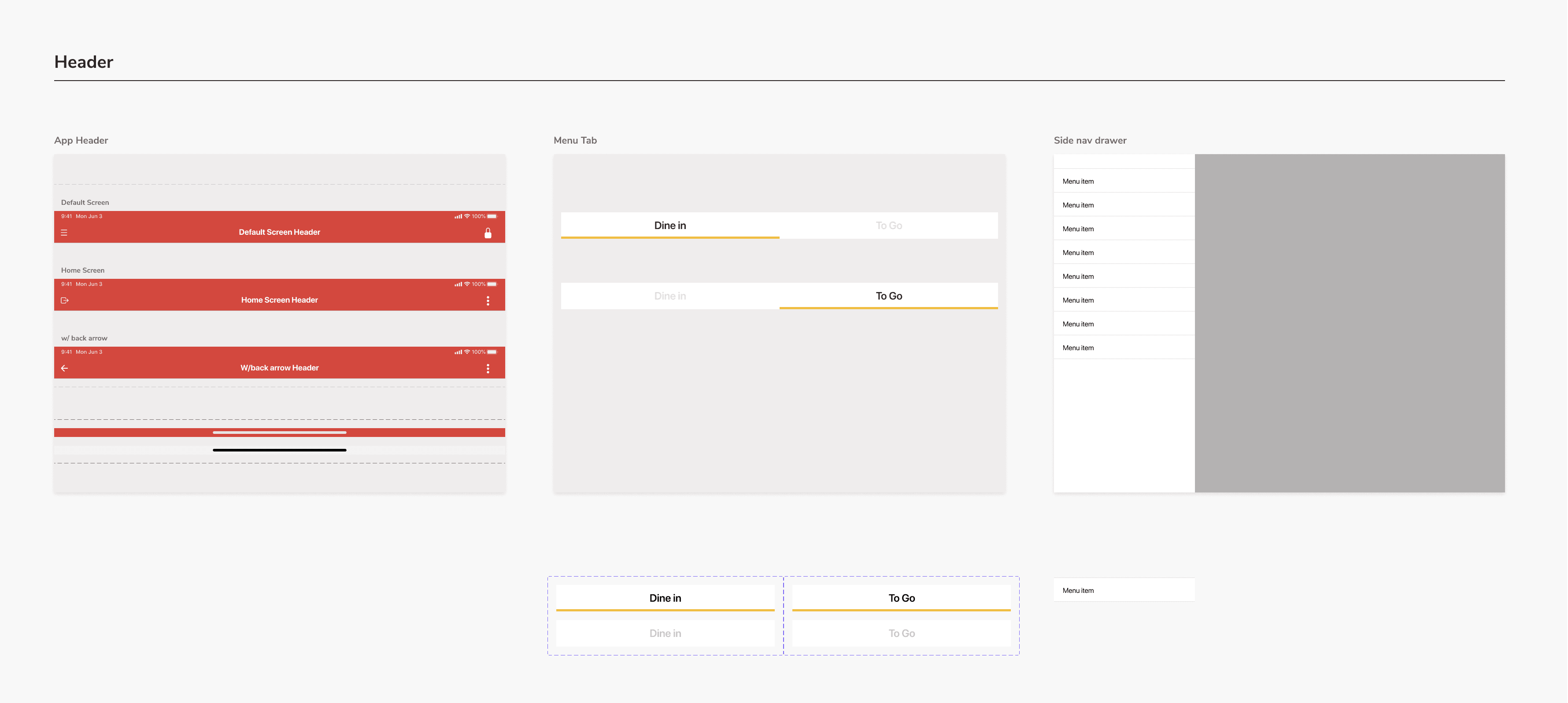
Menu and Keypad-related components

Modal-related Components
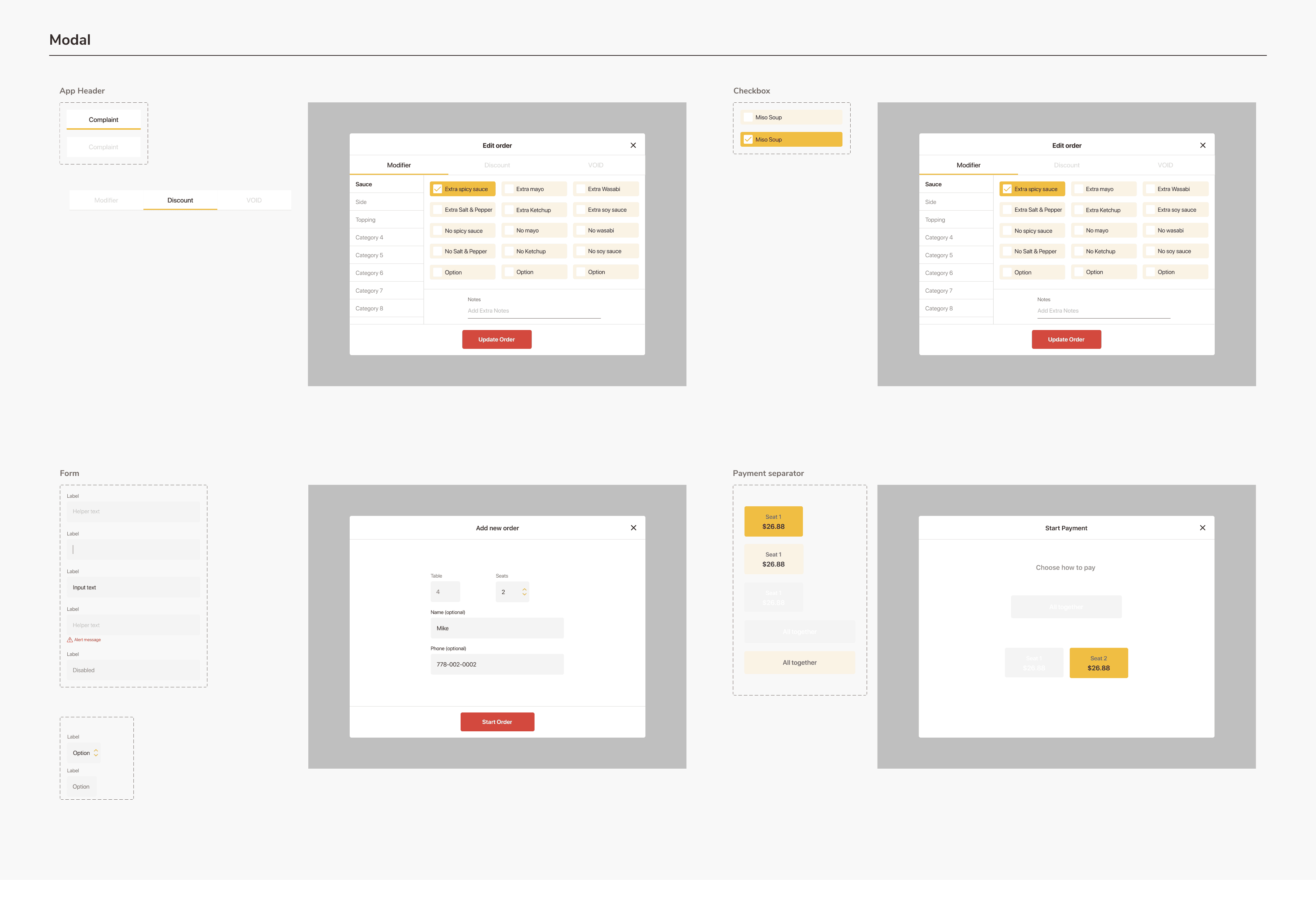
I acknowledged the importance of accessibility in design, a little while later of starting designing for iPad app. Even though it was a little difficult to change key colours due to those having already been determined, I tried adapting to accessibility starting by considering accuracy in icons, spacing, and content writing.
4. Generate UI and Prototyping
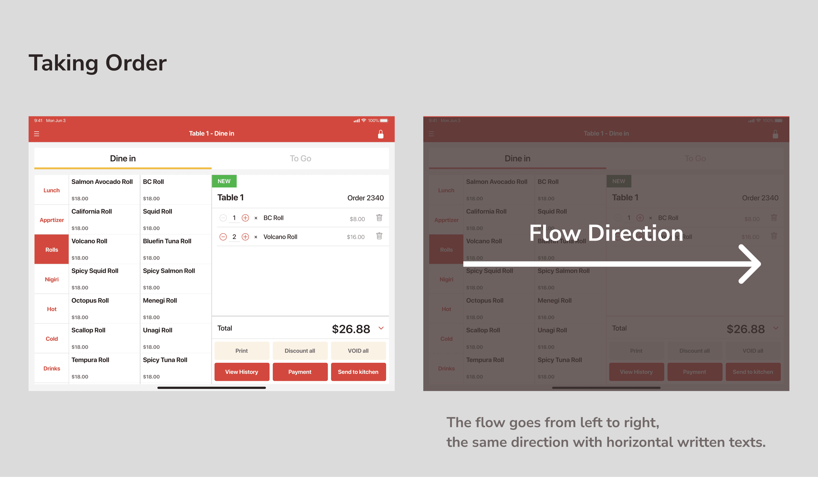
— Consider Information order
In this UI, the menu is filtered into the horizontal reading direction (from left to right), from choosing a category to editing or customizing an order.
Choose category
Choose menu item
Modify quantity, or edit/delete items
Send the order to the kitchen, or the payment
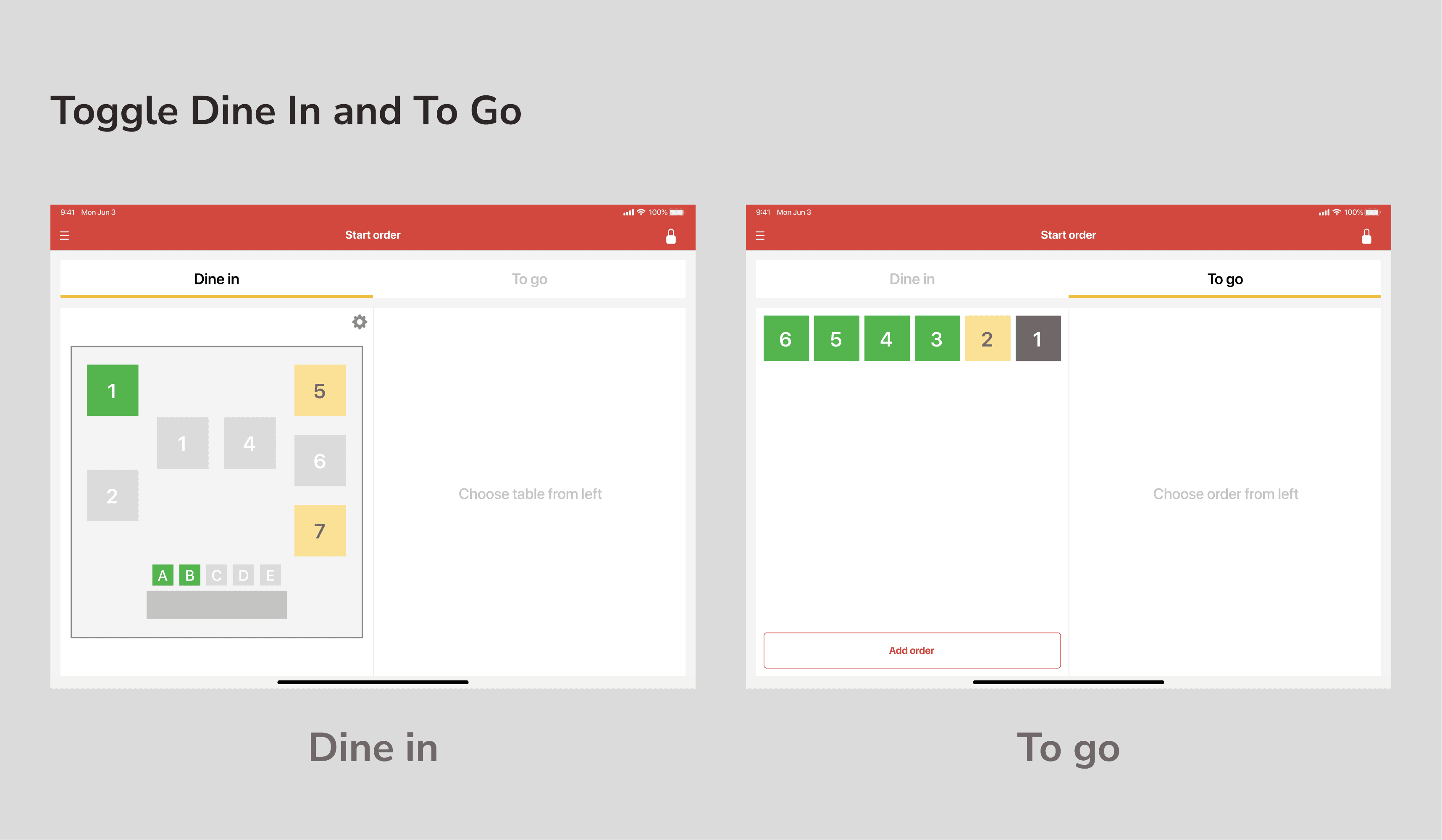
— Manage multiple order
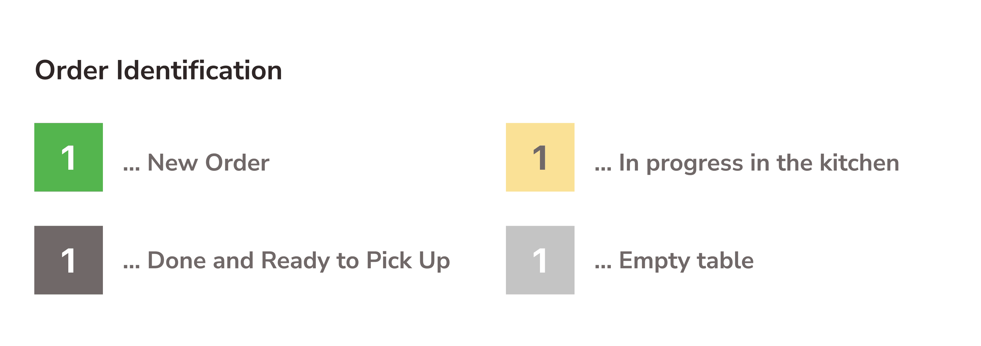
This app offers managing multiple orders for both dine-in and takeout. Staff can switch dine-in and takeout by tapping tabs.
State can be identified by the difference in color as below:
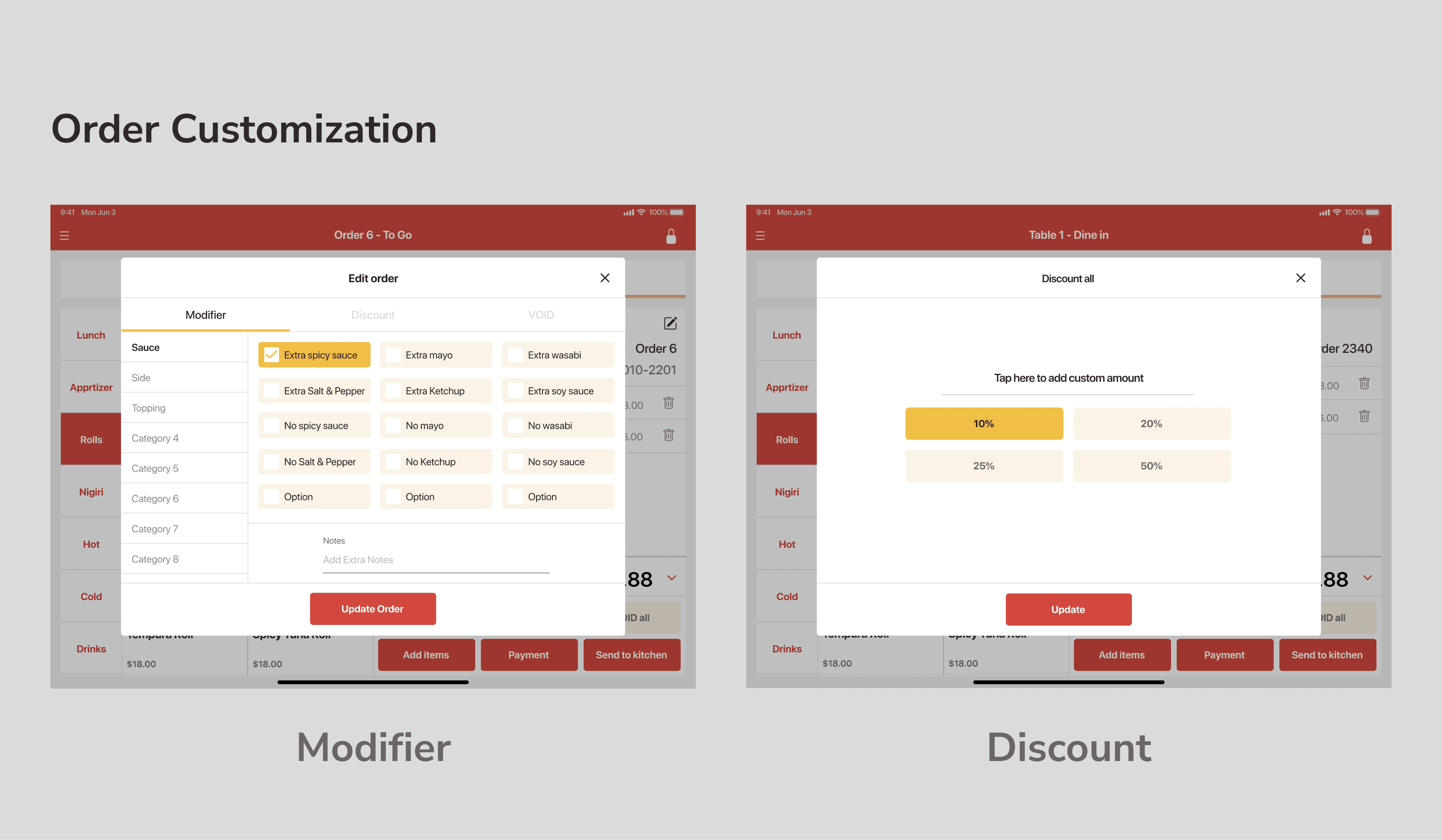
— Modify Orders - Discount, add sauce, topping or utensils
The feature for modification for all items or partial items are also available.
If you tap each items→ Customise, discount or make it void for Only the item
if you tap "Void All"or "Discount All" on the right bottom→ Customise, discount or make it void for All items
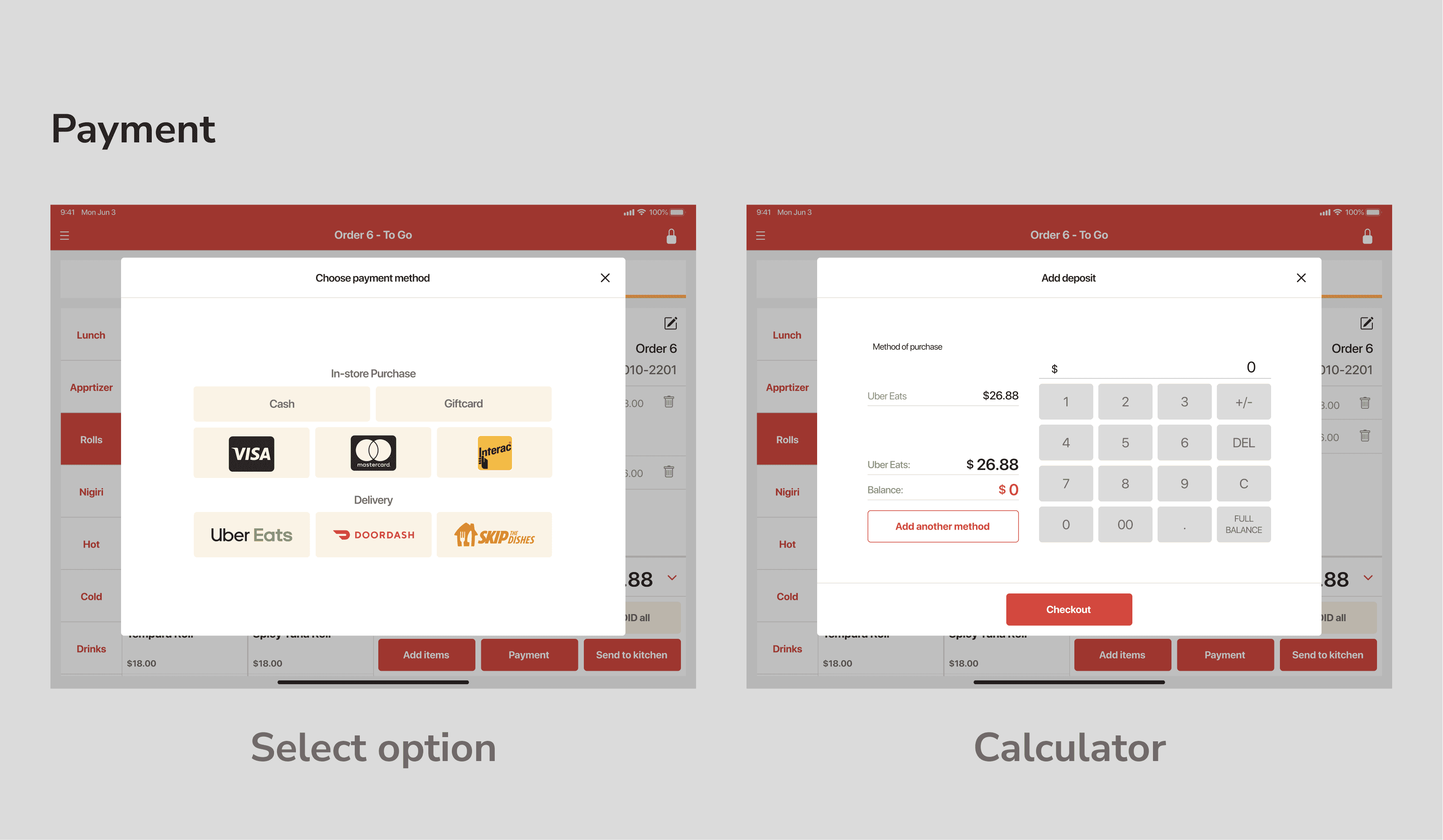
— Payment
Staff can process payment when they tapped the "Payment" button. For the dine-in, we offer transactions with cash, credit/debit card, or vouchers such as gift cards, and delivery services such as UberEats, DoorDash, or Skip the Dishes.
Of course, payment for multiple customers in one table is also available based on the number of seats when registered orders.
5. The Logo
I also made logos that can provide an impression of "joyful experience at the restaurant" based on typography provided by Google fonts to meet their desire even within a limited budget by the little arrangement in alignment and small elements.
Logo ideation:
left – Just arranged typography
right – typography with small elements

The completed logo

Workflow
1. Define Specifications, Create Rough Drafts
The outline of the flow was provided by the client because they want to launch the service as soon as possible.
I put them into actual UI by creating high-fidelity mockups to correspond to specifications.
Check and refine specifications with Store Owners
I checked requirements not just within the team but the actual restaurant as a potential user to get to know how to use or if there are any blockers on current POS systems, together with drawing screen transition diagrams and wireframes.
2. Define Key Colour and Typography
Based on the red colour which illustrates energy and enjoyment at the dining experience, I also used orange and yellow as analogical colours. For the typography, Nunito Sans is mainly used for Web app, however, I determined to use a standard font for each OS, to consider stable readability and development cost.
3. Create Design Guidelines
I made design guidelines by making key elements as components to minify design costs for creation and modification. It also made me possible to provide semantic design with accuracy in the structure of Figma file thanks to Variants, Auto Layout, and some other features.
Header and Nav Components
Menu and Keypad-related components
Modal-related Components
I acknowledged the importance of accessibility in design, a little while later of starting designing for iPad app. Even though it was a little difficult to change key colours due to those having already been determined, I tried adapting to accessibility starting by considering accuracy in icons, spacing, and content writing.
4. Generate UI and Prototyping
— Consider Information order
In this UI, the menu is filtered into the horizontal reading direction (from left to right), from choosing a category to editing or customizing an order.
Choose category
Choose menu item
Modify quantity, or edit/delete items
Send the order to the kitchen, or the payment
— Manage multiple order
This app offers managing multiple orders for both dine-in and takeout. Staff can switch dine-in and takeout by tapping tabs.
State can be identified by the difference in color as below:
— Modify Orders - Discount, add sauce, topping or utensils
The feature for modification for all items or partial items are also available.
If you tap each items→ Customise, discount or make it void for Only the item
if you tap "Void All"or "Discount All" on the right bottom→ Customise, discount or make it void for All items
— Payment
Staff can process payment when they tapped the "Payment" button. For the dine-in, we offer transactions with cash, credit/debit card, or vouchers such as gift cards, and delivery services such as UberEats, DoorDash, or Skip the Dishes.
Of course, payment for multiple customers in one table is also available based on the number of seats when registered orders.
5. The Logo
I also made logos that can provide an impression of "joyful experience at the restaurant" based on typography provided by Google fonts to meet their desire even within a limited budget by the little arrangement in alignment and small elements.
Logo ideation:
left – Just arranged typography
right – typography with small elements
The completed logo
Result
🤝 Introduced to some restaurants in Vancouver, BC, Canada
One test user accepted continuing to use our app permanently. Planning of installation in some other restaurants are in the works.
Result
🤝 Introduced to some restaurants in Vancouver, BC, Canada
One test user accepted continuing to use our app permanently. Planning of installation in some other restaurants are in the works.
Result
🤝 Introduced to some restaurants in Vancouver, BC, Canada
One test user accepted continuing to use our app permanently. Planning of installation in some other restaurants are in the works.
Reflection
Getting rid of unreasonable flow for passing design to the dev team by creating understandable guidelines was nice to do in this project. However, I realized that communication with the dev team when I provided the design was not effective to build desired output. I believe there are rooms to improve the quality and quantity of communication with developers.
Next Steps
The website, iPad app and their dashboard can integrate by improving as a more consistent and easy-to-use, easy-to-maintain components. Transformation and optimization for the experience from mobile websites to mobile apps is also the key. Additionally, optimizing components along with accessibility guidelines is one of the most important improvements, if this product can be considered a universal app for every kind of customer.
Staff Credit
1 UI/UX designer(Me)
1 Full-stack developer
1 Mobile app developer
1 project coordinator and manager
Staff Credit
1 UI/UX designer(Me)
1 Full-stack developer
1 Mobile app developer
1 project coordinator and manager
Staff Credit
1 UI/UX designer(Me)
1 Full-stack developer
1 Mobile app developer
1 project coordinator and manager
See Also:
See Also:
See Also:
Takenaka
Strengthen brand presence with experience design for Japanese Food Truck
Branding, UI/UX, Frontend Development
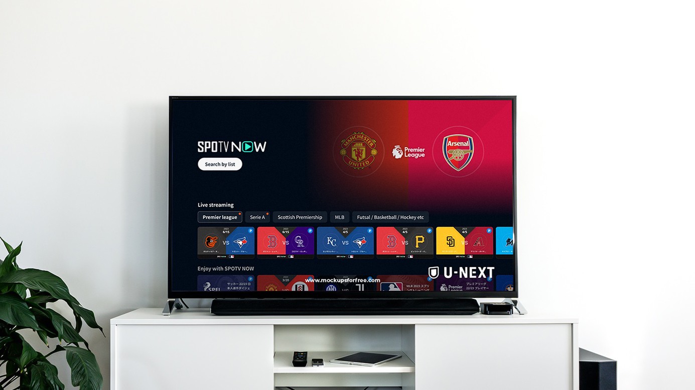
U-NEXT
Reasonably adding feature for sports category on cross-deviced video and streaming service
Interaction Design, Wireframing, Prototyping, Usability Testing, Visual Design
Liber
Building community for liberal arts through the media website
UI/UX design, Front-end development

roomvu
Design System development for Real Estate Marketing SaaS
Frontend Development, Design System Development
Takenaka
Strengthen brand presence with experience design for Japanese Food Truck
Branding, UI/UX, Frontend Development
U-NEXT
Reasonably adding feature for sports category on cross-deviced video and streaming service
Interaction Design, Wireframing, Prototyping, Usability Testing, Visual Design
Liber
Building community for liberal arts through the media website
UI/UX design, Front-end development
roomvu
Design System development for Real Estate Marketing SaaS
Frontend Development, Design System Development