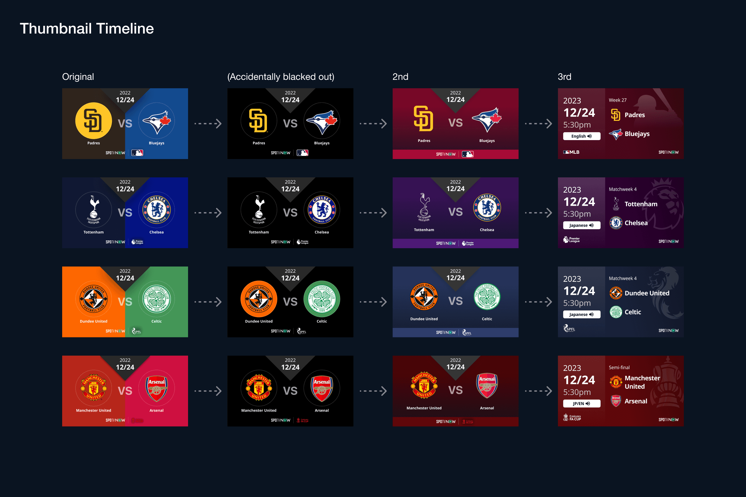
The UI was successfully released, but there were instances where improvements were needed for thumbnails post-release, leading to several revisions.
Improvement Due to Issues - Ver2
One day, unexpected changes in the content of the external API resulted in the removal, and all thumbnail's backgrounds went blackened. As a solution, I redesigned the thumbnail with the removal of the automated background.
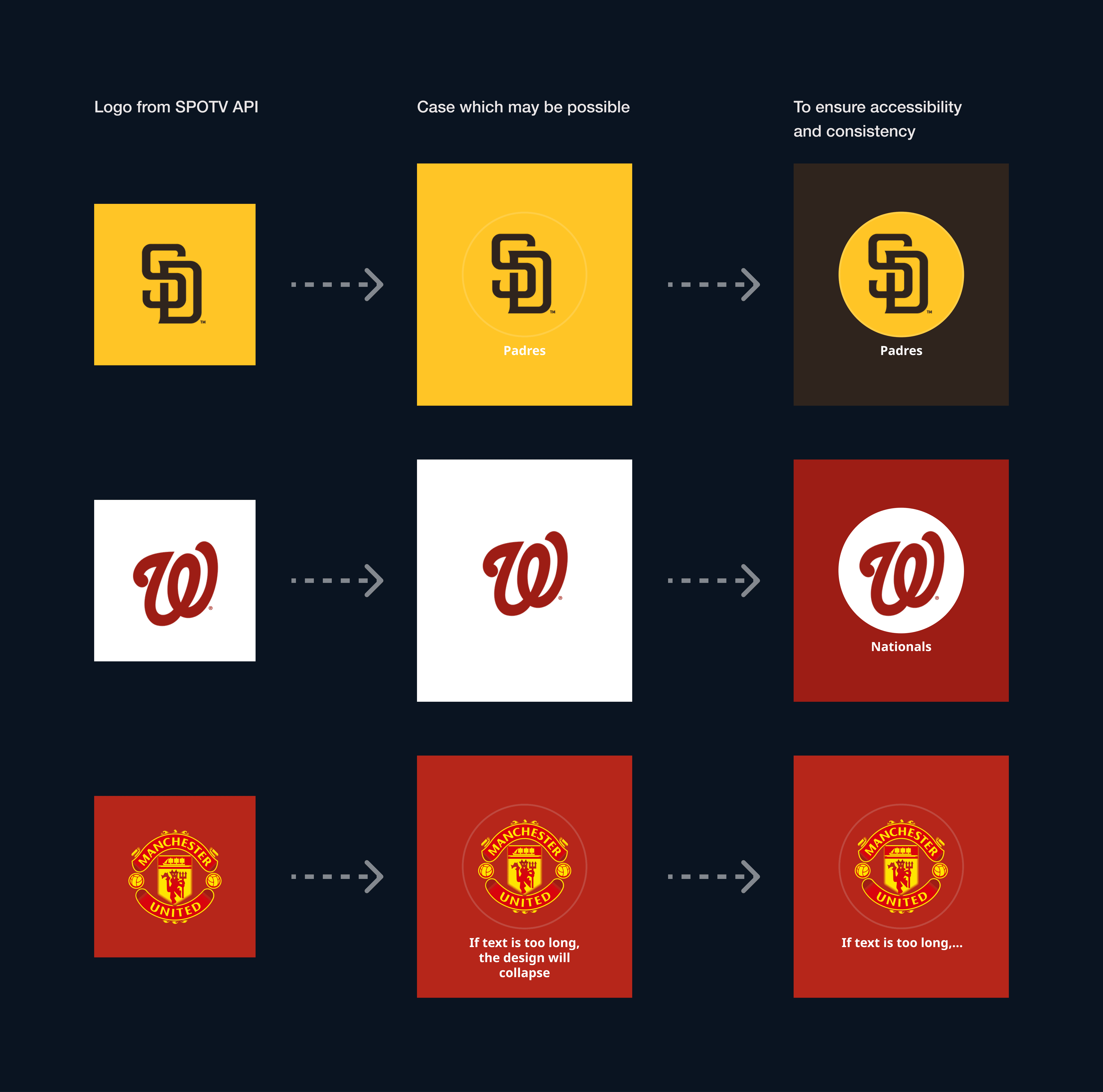
However, only removing the background made it difficult to distinguish between games and leagues. To resolve this, the approach of "extracting a single color from the league logo and using it as the background color" previously employed in other thumbnails(i.e. thumbnails for sports video content, not live streaming) was adopted for match thumbnails as well.
Applying the same hue as the league logo color on the background on the thumbnail made it easier to identify which games are for which leagues.
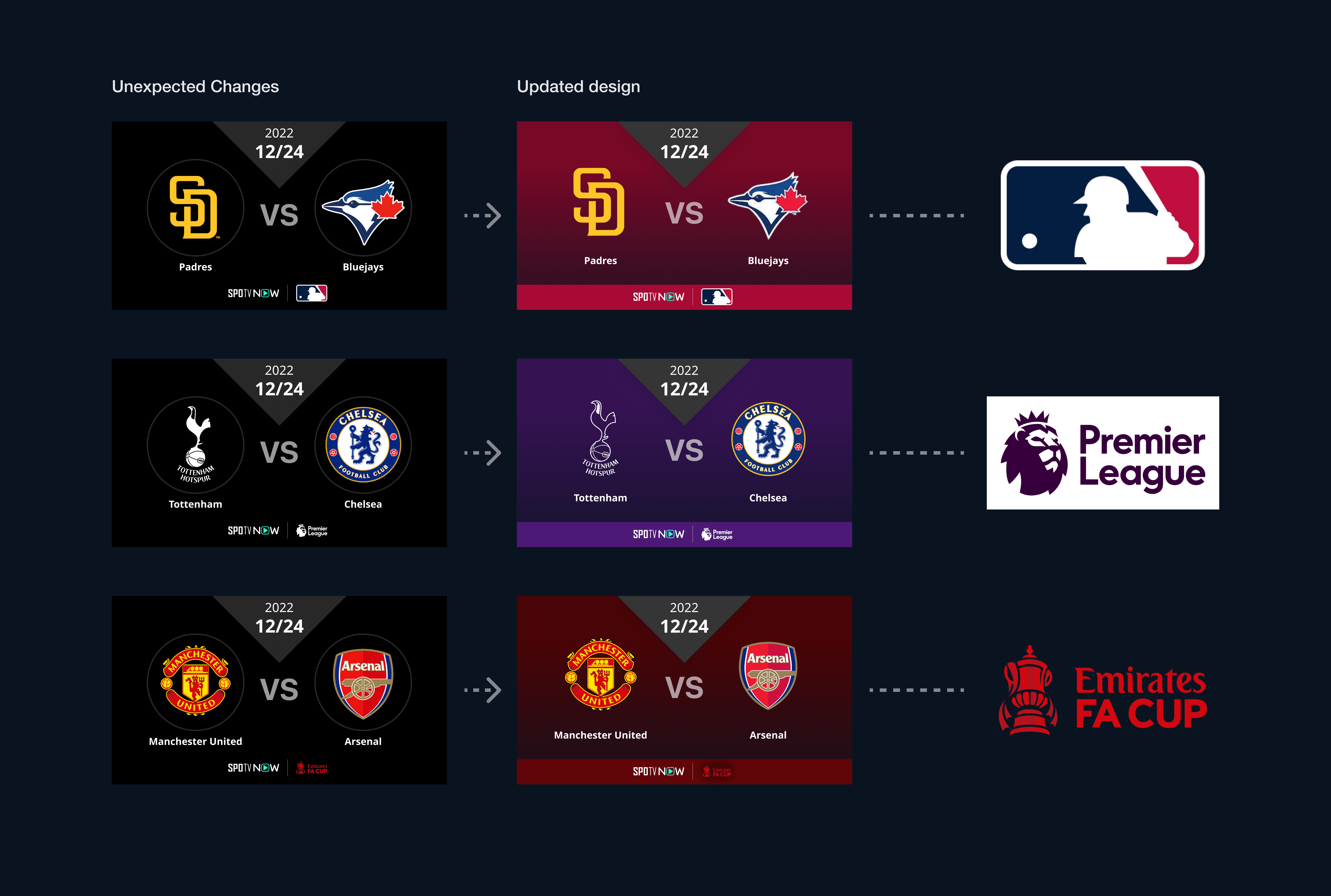
▲ Picked one color from league logo and adjusted them to ensure contrast
Improvement Based on User Feedback - Ver3
When LALIGA was newly added to our league lineup as exclusive licensed content, user interviews were conducted to gather feedback. Necessary information was added and refined based on the received feedback.
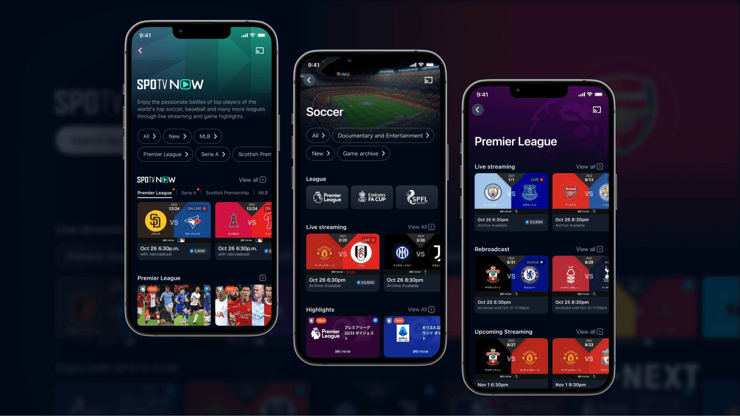
Soccer emerged as the most-watched genre, with diverse users ranging from passionate fans of specific teams and leagues to those who watch various soccer matches from the World Cup.
Consequently, the design prioritized information crucial to soccer, and the insights gained from this were applied to other genres.
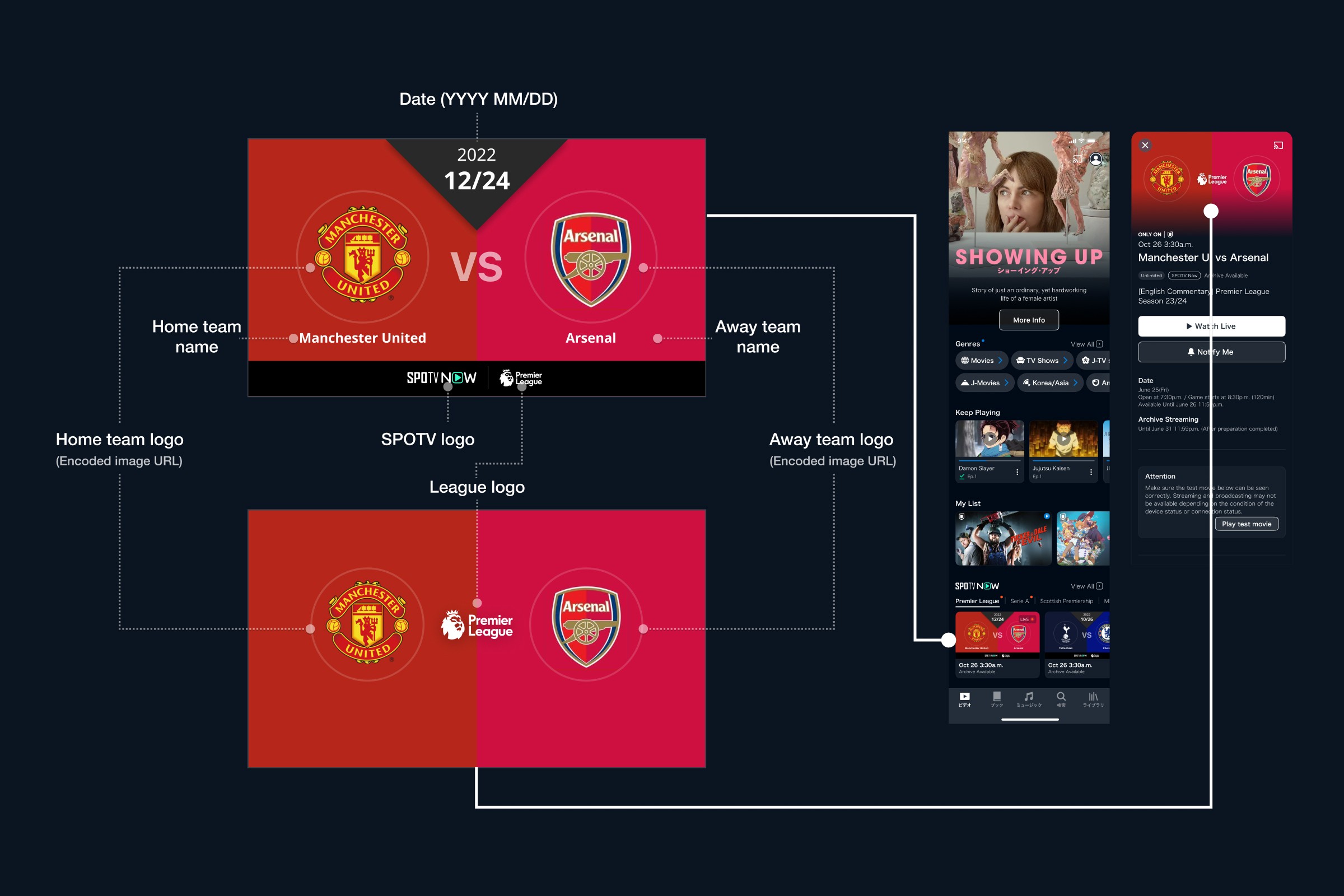
- Reordered information by priority by referencing thumbnails from platforms like YouTube for LALIGA and Premier League. This involved organizing the font size and color
- Considered not only on the web and mobile but also on TV which has very limited spaces with strict constraints to adding information
- Ensured all essential information should be visible
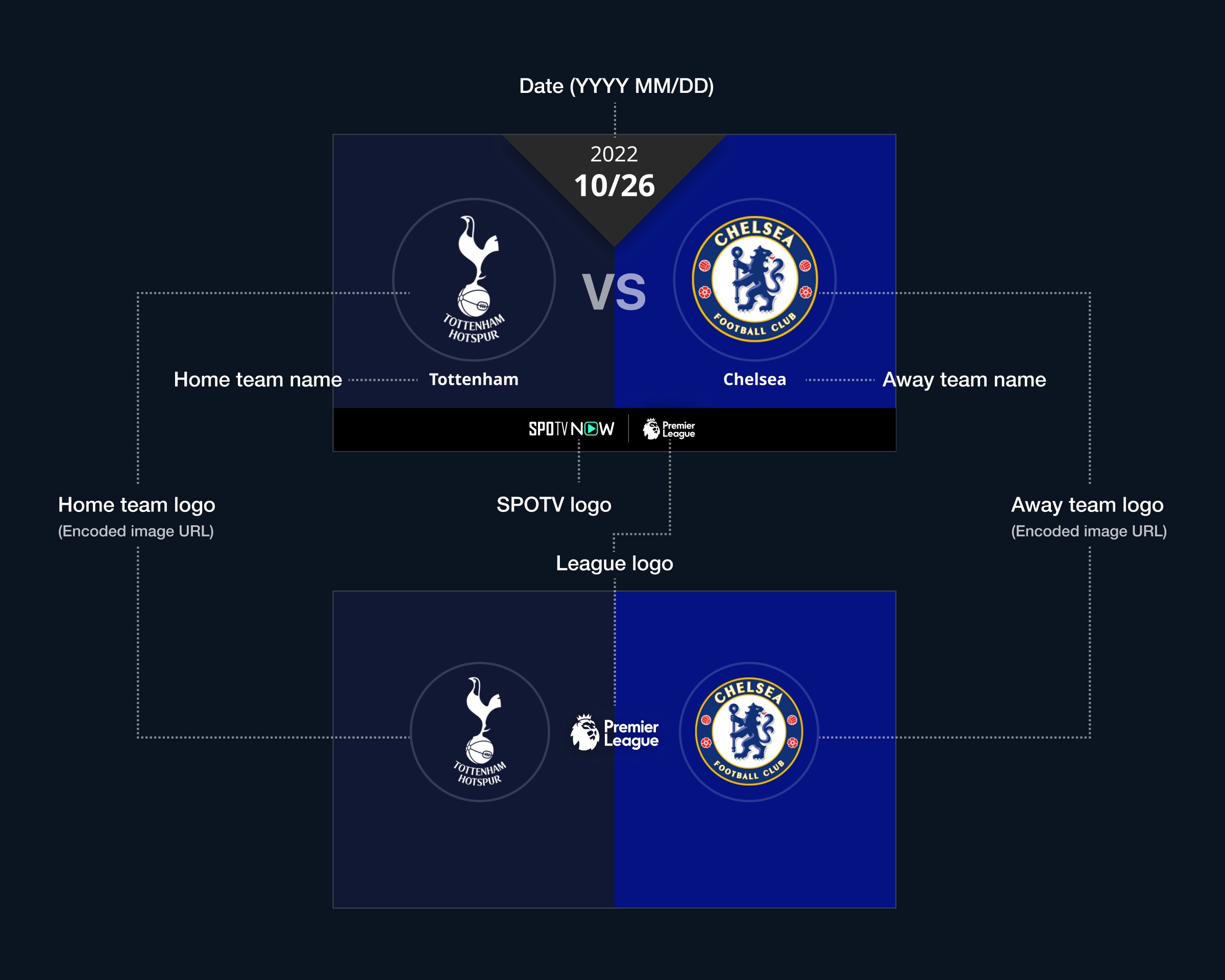
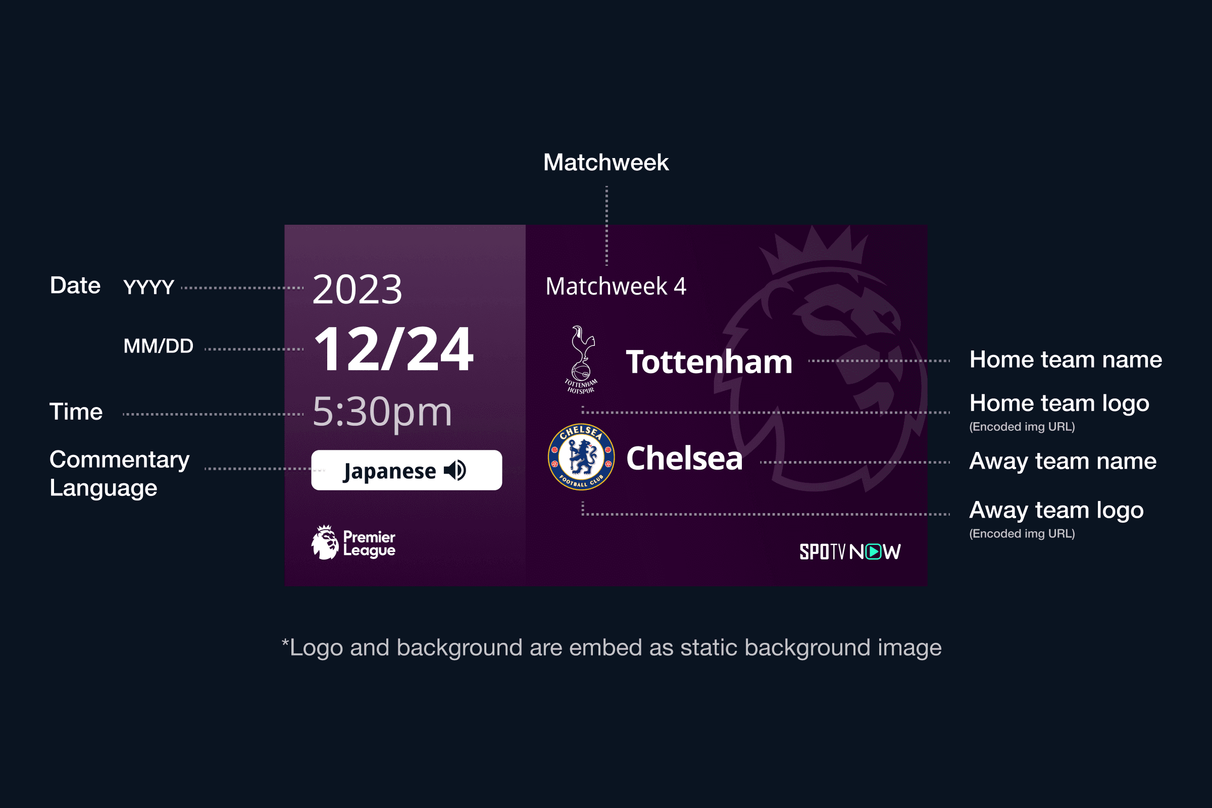
The following included (order by prioritization):
- Start date and time of the broadcast
- League
- Team
- Round
- Commentary Language
- SPOTV's logo, if provided
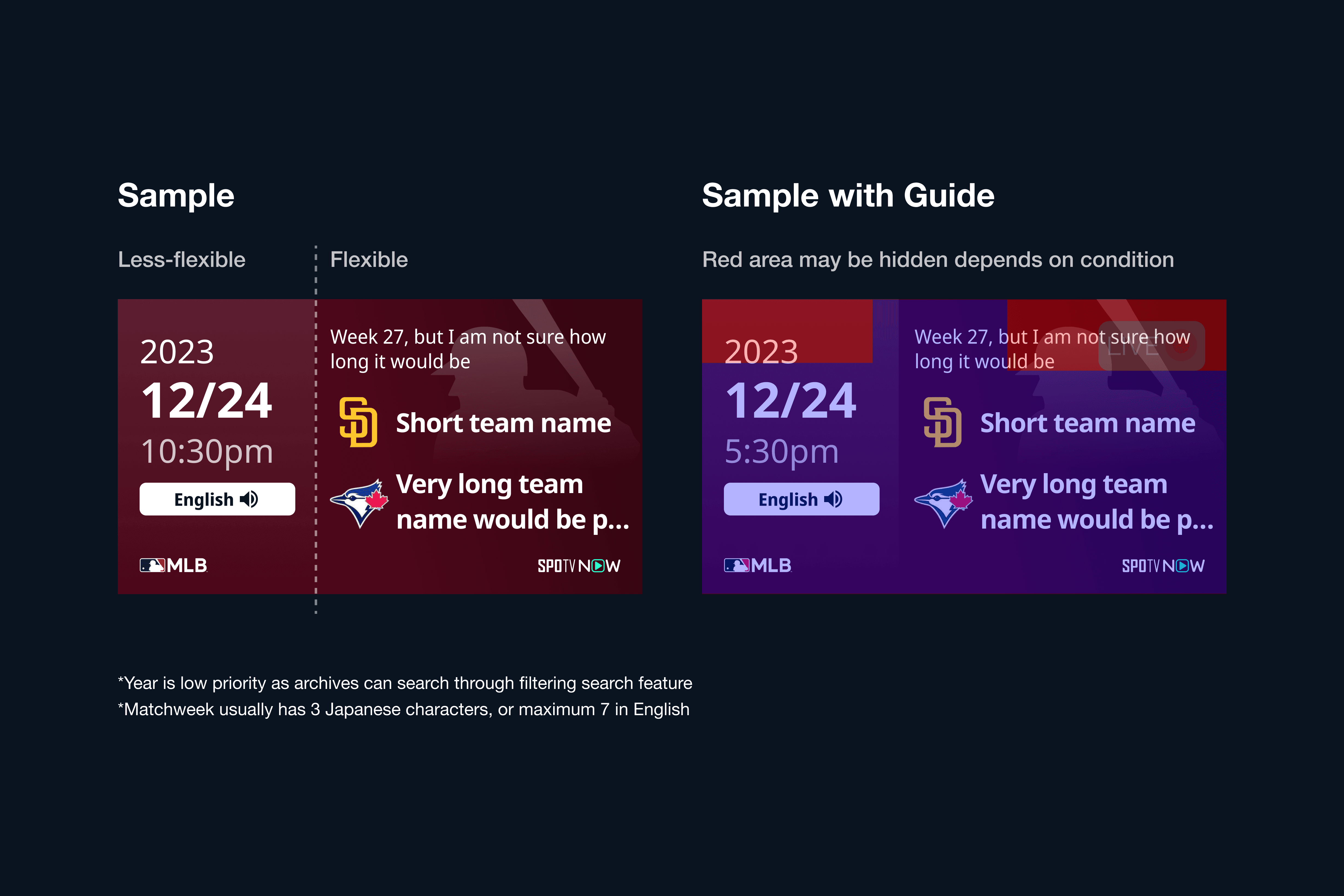
By the priority of date and time, Divided sections into less flexible ones and flexible ones. Since the name could be 20+ characters long depending on the team, I placed team name and match name in the flexible section, and the date, time and language were placed in the less flexible section.
Considered Durability of Accuracy on TV and mobile
Since TV is an important device to watch sports, considering accuracy on both TV and mobile is key. Since both thumbnails could look very tiny by the assumption of TV which could be watched from 3 meters away in the living room, I made font size bigger as much as possible while keeping the dynamics of weights.
Lastly, here is the timeline of how the thumbnail changed. This is how I handled the prioritization of accessible thumbnails across different types of devices.
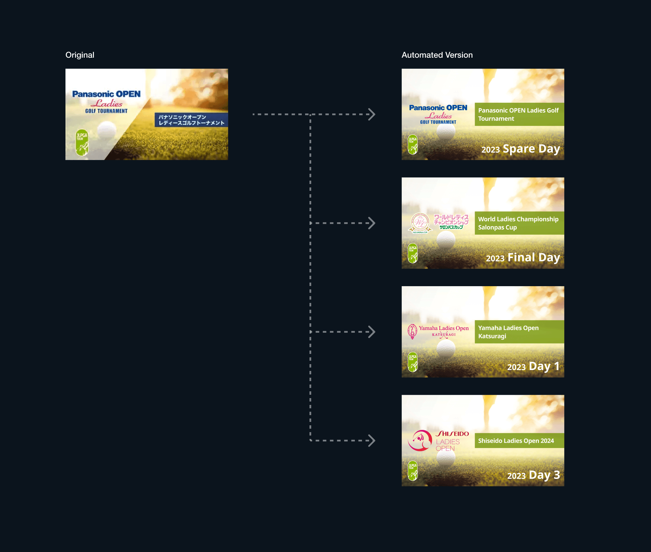
Expansion for other categories
The solution above was made only for the matches. However, we still had a pain in quick delivery for thumbnails in golf tour live streamings and videos. We also replaced the golf tour one with auto-generated images. It has been quickly made within two weeks from the kickstart to the final development.